Rysowanie X w CSS
Mam div, który wygląda jak pomarańczowy kwadrat
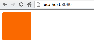
Chciałbym narysować białe X w tym div tak aby wyglądało bardziej jak

W każdym razie zrobić to w CSS, czy będzie łatwiej po prostu narysować to w Photoshopie i użyć obrazu jako tła div? Kod div wygląda tak:
div {
    height: 100px;
    width: 100px;
    background-color: #FA6900;
    border-radius: 5px;
}
11 answers
Możesz po prostu umieścić literę X w HTML wewnątrz div, a następnie stylizować ją za pomocą css.
Zobacz JSFiddle: http://jsfiddle.net/uSwbN/
HTML:
<div id="orangeBox">
  <span id="x">X</span>
</div>
CSS:
#orangeBox {
  background: #f90;
  color: #fff;
  font-family: 'Helvetica', 'Arial', sans-serif;
  font-size: 2em;
  font-weight: bold;
  text-align: center;
  width: 40px;
  height: 40px;
  border-radius: 5px;
}
Warning: date(): Invalid date.timezone value 'Europe/Kyiv', we selected the timezone 'UTC' for now. in /var/www/agent_stack/data/www/doraprojects.net/template/agent.layouts/content.php on line 54
2013-09-20 15:45:13
Chcesz byt znany jako znak krzyża:
Http://www.fileformat.info/info/unicode/char/274c/index.htm
Jego kod to ❌ i wyświetla się jak
Jeśli chcesz idealnie wyśrodkowany Znak Krzyża, w ten sposób:

Wypróbuj następujący CSS:
div {
    height: 100px;
    width: 100px;
    background-color: #FA6900;
    border-radius: 5px;
    position: relative;
}

div:after {
    position: absolute;
    top: 0;
    bottom: 0;
    left: 0;
    right: 0;
    content: "\274c"; /* use the hex value here... */
    font-size: 50px;
    color: #FFF;
    line-height: 100px;
    text-align: center;
}
Problem Z Przeglądarką
Znacznik krzyżowy nie jest wyświetlany w przeglądarce Safari lub Chrome. Jednak ten sam podmiot wyświetla się dobrze w Firefoksie, IE i operze.
Bezpiecznie jest używać mniejszej, ale podobnie ukształtowanej jednostki znaku mnożenia, ×, która wyświetla się jako ×.
Warning: date(): Invalid date.timezone value 'Europe/Kyiv', we selected the timezone 'UTC' for now. in /var/www/agent_stack/data/www/doraprojects.net/template/agent.layouts/content.php on line 54
2015-07-07 19:23:07
Rozwiązanie pojedynczego elementu: 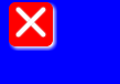
body{
    background:blue;
}

div{
    width:40px;
    height:40px;
    background-color:red;
    position:relative;
    border-radius:6px;
    box-shadow:2px 2px 4px 0 white;
}

div:before,div:after{
    content:'';
    position:absolute;
    width:36px;
    height:4px;
    background-color:white;
    border-radius:2px;
    top:16px;
    box-shadow:0 0 2px 0 #ccc;
}

div:before{
    -webkit-transform:rotate(45deg);
    -moz-transform:rotate(45deg);
    transform:rotate(45deg);
    left:2px;
}
div:after{
    -webkit-transform:rotate(-45deg);
    -moz-transform:rotate(-45deg);
    transform:rotate(-45deg);
    right:2px;
}<div></div>Warning: date(): Invalid date.timezone value 'Europe/Kyiv', we selected the timezone 'UTC' for now. in /var/www/agent_stack/data/www/doraprojects.net/template/agent.layouts/content.php on line 54
2015-02-15 14:45:20
Kolejna próba... ten używa ×. Wiele przykładów na tej stronie pokazuje tylko dla mnie jako pudełko, ale × działa
HTML
<div class="close"></div>
CSS
.close {
    height: 100px;
    width: 100px;
    background-color: #FA6900;
    border-radius: 5px;
}
.close:after {
    position:relative;
    content:"\d7";
    font-size:177px;
    color:white;
    font-weight:bold;
    top:-53px;
    left:-2px
}
Warning: date(): Invalid date.timezone value 'Europe/Kyiv', we selected the timezone 'UTC' for now. in /var/www/agent_stack/data/www/doraprojects.net/template/agent.layouts/content.php on line 54
2013-09-20 15:52:11
Jeszcze jedno rozwiązanie czystego CSS (tj. bez użycia obrazów, znaków lub dodatkowych czcionek), oparte na @Bansoa jest odpowiedzią'S answer .
Dzięki temu, że jest on responsywny, można go łatwo rozbudować i dodać trochę magii Flexboxa.Krzyż w tym przykładzie Automatycznie skaluje się do dowolnego kwadratowego pojemnika, a aby zmienić grubość jego linii, wystarczy dostroić height: 4px; (aby krzyżyk naprawdę reagował , możesz ustawić height w procentach lub innych jednostkach względnych).
div {
    position: relative;
    height: 200px; /* this can be anything */
    width: 200px;  /* ...but maintain 1:1 aspect ratio */
    display: flex;
    flex-direction: column;
    justify-content: center;
    border: 1px solid pink;
}

div::before,
div::after {
    position: absolute;
    content: '';
    width: 100%;
    height: 4px; /* cross thickness */
    background-color: black;
}

div::before {
    transform: rotate(45deg);
}

div::after {
    transform: rotate(-45deg);
}<div></div>Warning: date(): Invalid date.timezone value 'Europe/Kyiv', we selected the timezone 'UTC' for now. in /var/www/agent_stack/data/www/doraprojects.net/template/agent.layouts/content.php on line 54
2017-05-23 12:02:46
Możesz użyć właściwości CSS "content":
div {
    height: 100px;
    width: 100px;
    background-color: #FA6900;
    border-radius: 5px;
}

div:after {
    content: "X";
    font-size: 2em;
    color: #FFF;
}
Like this: http://jsfiddle.net/HKtFV/
Warning: date(): Invalid date.timezone value 'Europe/Kyiv', we selected the timezone 'UTC' for now. in /var/www/agent_stack/data/www/doraprojects.net/template/agent.layouts/content.php on line 54
2013-09-20 15:36:58
#x{
    width: 20px;
    height: 20px;
    background-color:orange;
    position:relative;
    border-radius:2px;
}
#x::after,#x::before{
    position:absolute;
    top:9px;
    left:0px;
    content:'';
    display:block;
    width:20px;
    height:2px;
    background-color:red;

}
#x::after{
    -webkit-transform: rotate(45deg);
    -moz-transform: rotate(45deg);
    -ms-transform: rotate(45deg);
    -o-transform: rotate(45deg);
    transform: rotate(45deg);
}
#x::before{
    -webkit-transform: rotate(-45deg);
    -moz-transform: rotate(-45deg);
    -ms-transform: rotate(-45deg);
    -o-transform: rotate(-45deg);
    transform: rotate(-45deg);
}
<div id=x>
</div>Możesz to zrobić przez stylizację na " x "
text-align: center;
font-size: 120px;
line-height: 100px;
color: white;
font-family: monospace;
Warning: date(): Invalid date.timezone value 'Europe/Kyiv', we selected the timezone 'UTC' for now. in /var/www/agent_stack/data/www/doraprojects.net/template/agent.layouts/content.php on line 54
2013-09-20 15:40:45
Uwielbiam to pytanie! Możesz łatwo dostosować mój kod poniżej, aby był biały × na pomarańczowym kwadracie:

Demo tutaj
Oto SCSS (który można łatwo przekonwertować do CSS):
$pFontSize: 18px;
p {
  font-size: $pFontSize;
}
span{
  font-weight: bold;
}
.x-overlay,
.x-emoji-overlay {
  position: relative;
}

.x-overlay,
.x-emoji-overlay {
  &:after {
    position: absolute;
    top: 0;
    bottom: 0;
    left: 0;
    right: 0;
    color: red;
    text-align: center;
  }
}

.x-overlay:after {
  content: '\d7';
  font-size: 3 * $pFontSize;
  line-height: $pFontSize;
  opacity: 0.7;
}

.x-emoji-overlay:after {
  content: "\274c";
  padding: 3px;
  font-size: 1.5 * $pFontSize;
  line-height: $pFontSize;
  opacity: 0.5;
}

.strike {
  position: relative;
  display: inline-block;
}

.strike::before {
  content: '';
  border-bottom: 2px solid red;
  width: 110%;
  position: absolute;
  left: -2px;
  top: 46%;
}

.crossed-out {
  /*inspired by https://www.tjvantoll.com/2013/09/12/building-custom-text-strikethroughs-with-css/*/
  position: relative;
  display: inline-block;
  &::before,
  &::after {
    content: '';
    width: 110%;
    position: absolute;
    left: -2px;
    top: 45%;
    opacity: 0.7;
  }
  &::before {
    border-bottom: 2px solid red;
    -webkit-transform: skewY(-20deg);
    transform: skewY(-20deg);
  }
  &::after {
    border-bottom: 2px solid red;
    -webkit-transform: skewY(20deg);
    transform: skewY(20deg);
  }
}
Warning: date(): Invalid date.timezone value 'Europe/Kyiv', we selected the timezone 'UTC' for now. in /var/www/agent_stack/data/www/doraprojects.net/template/agent.layouts/content.php on line 54
2017-03-11 15:51:09
HTML
<div class="close-orange"></div>
CSS
.close-orange {
  height: 100px;
  width: 100px;
  background-color: #FA6900;
  border-radius: 5px;
}
.close-orange:before,.close-orange:after{
  content:'';
  position:absolute;
  width: 50px;
  height: 4px;
  background-color:white;
  border-radius:2px;
  top: 55px;
}
.close-orange:before{
  -webkit-transform:rotate(45deg);
  -moz-transform:rotate(45deg);
  transform:rotate(45deg);
  left: 32.5px;
}
.close-orange:after{
  -webkit-transform:rotate(-45deg);
  -moz-transform:rotate(-45deg);
  transform:rotate(-45deg);
  left: 32.5px;
}
Warning: date(): Invalid date.timezone value 'Europe/Kyiv', we selected the timezone 'UTC' for now. in /var/www/agent_stack/data/www/doraprojects.net/template/agent.layouts/content.php on line 54
2016-08-20 11:21:00
Możesz zrobić całkiem ładne X z gradientami CSS:

Demo: https://codepen.io/JasonWoof/pen/rZyRKR
Kod:
<span class="close-x"></span>
<style>
    .close-x {
        display: inline-block;
        width: 20px;
        height: 20px;
        border: 7px solid #f56b00;
        background:
            linear-gradient(45deg, rgba(0,0,0,0) 0%,rgba(0,0,0,0) 43%,#fff 45%,#fff 55%,rgba(0,0,0,0) 57%,rgba(0,0,0,0) 100%),
            linear-gradient(135deg, #f56b00 0%,#f56b00 43%,#fff 45%,#fff 55%,#f56b00 57%,#f56b00 100%);
    }
</style>
Warning: date(): Invalid date.timezone value 'Europe/Kyiv', we selected the timezone 'UTC' for now. in /var/www/agent_stack/data/www/doraprojects.net/template/agent.layouts/content.php on line 54
2018-09-03 00:05:22