Tworzenie okręgów CSS3 połączonych liniami
Muszę zaimplementować następującą kombinację kół i linii w CSS i szukam wskazówek, jak to skutecznie zaimplementować. Okręgi i linie powinny wyglądać tak:

Jestem w stanie zaimplementować kręgi jako takie:
span.step {
  background: #ccc;
  border-radius: 0.8em;
  -moz-border-radius: 0.8em;
  -webkit-border-radius: 0.8em;
  color: #1f79cd;
  display: inline-block;
  font-weight: bold;
  line-height: 1.6em;
  margin-right: 5px;
  text-align: center;
  width: 1.6em;
}
Rozmiar okręgu zmienia się w zależności od tego, czy jest to aktywny krok, czy nie, a kolor linii łączącej okręgi zmienia się jako zależy od statusu. Jak miałbym to osiągnąć?
8 answers
Możesz osiągnąć ten efekt bez dodatkowych znaczników za pomocą pseudo-elementów i sąsiedniego selektora rodzeństwa(~):
li {
  width: 2em;
  height: 2em;
  text-align: center;
  line-height: 2em;
  border-radius: 1em;
  background: dodgerblue;
  margin: 0 1em;
  display: inline-block;
  color: white;
  position: relative;
}

li::before{
  content: '';
  position: absolute;
  top: .9em;
  left: -4em;
  width: 4em;
  height: .2em;
  background: dodgerblue;
  z-index: -1;
}


li:first-child::before {
  display: none;
}

.active {
  background: dodgerblue;
}

.active ~ li {
  background: lightblue;
}

.active ~ li::before {
  background: lightblue;
}
<ul>
<li>1</li>
<li>2</li>
<li>3</li>
<li class="active">4</li>
<li>5</li>
<li>6</li>
<li>7</li>
</ul> Warning: date(): Invalid date.timezone value 'Europe/Kyiv', we selected the timezone 'UTC' for now. in /var/www/agent_stack/data/www/doraprojects.net/template/agent.layouts/content.php on line 54
2019-10-02 20:29:18

Praca z doskonałą odpowiedź z @ bookcasey znalazłem się robi to w odwrotny sposób, aby uzyskać to responsywne;
- okręgi umieszczam jako
::beforepseudo selektory (z automatycznym licznikiem css). - linie pomiędzy są elementami
li, więc mogą być rozciągnięte przez flexbox.
Teraz rozciąga się, aby wypełnić rodzica i zajmuje się różną liczbą kroków automatycznie. Można również zrobić rzeczy, takie jak dostosować font-size na rodzica ul i niech całość się dostosuje.
Jestem pewien, że da się to poprawić, więc zapraszam do współtworzenia :)
Interactive CodePen: Flexbox Timeline with steps: http://codepen.io/ccondrup/pen/bqbGWB?editors=1100
ul {
align-content: center;
align-items: center;
counter-reset: stepCount;
display: flex;
justify-content: space-around;
margin: 10vh auto 20vh; /* for codepen */
}
li {
background: dodgerblue;
color: white;
content: ' ';
display: flex;
flex-grow: 1;
height: .3em;
line-height: 1em;
margin: 0;
position: relative;
text-align: right;
z-index: -1;
}
li::before {
background: dodgerblue;
border-radius: 50%;
color: white;
content: counter(stepCount);
counter-increment: stepCount;
height: 2em;
left: -2em;
line-height: 2em;
position: absolute;
text-align: center;
top: -.85em;
width: 2em;
}
li.active {
background-color: lightblue;
}
li.active~li {
background-color: lightblue;
}
li.active~li::before {
background-color: lightblue;
}
li:last-child {
flex-grow: 0;
flex-shrink: 1;
flex-basis: 0;
/* Shorthand: flex: 0 1 0; */
}
ul.bigger {
font-size: 1.3em;
}
ul.highlight-active li.active::before {
font-size: 1.6em;
background: navy;
}
ul.roman li::before {
content: counter(stepCount, upper-roman);
}
ul.triangle li::before {
width: 0;
height: 0;
border-radius: 0;
border-left: 1em solid white;
border-right: 1em solid white;
border-bottom: .8em solid dodgerblue;
content: '';
top: -.65em;
}
ul.triangle li:first-child::before {
left: 0;
}
ul.triangle li.active~li::before {
border-bottom-color: lightblue;
}<ul>
<li></li>
<li></li>
<li class="active"></li>
<li></li>
<li></li>
<li></li>
</ul>
<ul class="bigger highlight-active">
<li></li>
<li></li>
<li class="active"></li>
<li></li>
</ul>
<ul class="roman">
<li></li>
<li></li>
<li></li>
<li></li>
<li></li>
<li></li>
<li class="active"></li>
<li></li>
<li></li>
<li></li>
<li></li>
<li></li>
</ul>
<ul class="triangle">
<li></li>
<li></li>
<li class="active"></li>
<li></li>
<li></li>
</ul>Warning: date(): Invalid date.timezone value 'Europe/Kyiv', we selected the timezone 'UTC' for now. in /var/www/agent_stack/data/www/doraprojects.net/template/agent.layouts/content.php on line 54
2017-05-23 11:54:53
Nie jest mój, ale działa całkiem dobrze i wygląda elegancko, działa tylko z css i można go więcej perzonalizować. Źródło http://jsfiddle.net/Misiu/y1Lo3qh1/
var i = 1;
$('.progress .circle').removeClass().addClass('circle');
$('.progress .bar').removeClass().addClass('bar');
setInterval(function () {
$('.progress .circle:nth-of-type(' + i + ')').addClass('active');
$('.progress .circle:nth-of-type(' + (i - 1) + ')').removeClass('active').addClass('done');
$('.progress .circle:nth-of-type(' + (i - 1) + ') .label').html('✓');
$('.progress .bar:nth-of-type(' + (i - 1) + ')').addClass('active');
$('.progress .bar:nth-of-type(' + (i - 2) + ')').removeClass('active').addClass('done');
i++;
if (i == 8) {
$('.progress .circle').removeClass().addClass('circle');
$('.progress .bar').removeClass().addClass('bar');
i = 1;
}
}, 1000);*,
*:after,
*:before {
margin: 0;
padding: 0;
box-sizing: border-box;
font-family: "Open Sans";
}
/* Form Progress */
.progress {
margin: 20px auto;
text-align: center;
padding-bottom: 80px;
}
.progress .circle,
.progress .bar {
display: inline-block;
background: #fff;
width: 40px;
height: 40px;
border-radius: 40px;
border: 1px solid #d5d5da;
vertical-align:top;
}
.progress .bar {
position: relative;
width: 80px;
height: 6px;
margin: 0 -5px 17px -5px;
border-left: none;
border-right: none;
border-radius: 0;
top:16px;
vertical-align:top
}
.progress .circle .label {
display: inline-block;
width: 32px;
height: 32px;
line-height: 32px;
border-radius: 32px;
margin-top: 3px;
color: #b5b5ba;
font-size: 17px;
}
.progress .circle .title {
color: #b5b5ba;
font-size: 13px;
line-height: 18px;
margin-left: -30px;
display: block;
width: 100px;
margin-top: 5px;
}
/* Done / Active */
.progress .bar.done,
.progress .circle.done {
background: #eee;
}
.progress .bar.active {
background: linear-gradient(to right, #EEE 40%, #FFF 60%);
}
.progress .circle.done .label {
color: #FFF;
background: #8bc435;
box-shadow: inset 0 0 2px rgba(0, 0, 0, .2);
}
.progress .circle.done .title {
color: #444;
}
.progress .circle.active .label {
color: #FFF;
background: #0c95be;
box-shadow: inset 0 0 2px rgba(0, 0, 0, .2);
}
.progress .circle.active .title {
color: #0c95be;
}<script src="https://ajax.googleapis.com/ajax/libs/jquery/2.1.1/jquery.min.js"></script>
<link href='http://fonts.googleapis.com/css?family=Open+Sans' rel='stylesheet' type='text/css'>
<div class="progress">
<div class="circle done"> <span class="label">1</span>
<span class="title">Order</span>
</div> <span class="bar done"></span>
<div class="circle done"> <span class="label">2</span>
<span class="title">Address</span>
</div> <span class="bar active"></span>
<div class="circle active"> <span class="label">3</span>
<span class="title">Payment</span>
</div> <span class="bar"></span>
<div class="circle"> <span class="label">4</span>
<span class="title">Review</span>
</div> <span class="bar"></span>
<div class="circle"> <span class="label">5</span>
<span class="title">Finish</span>
</div>
</div>
<div class="progress">
<div class="circle done"> <span class="label">1</span>
<span class="title">Order informations</span>
</div> <span class="bar active"></span>
<div class="circle active"> <span class="label">2</span>
<span class="title">Order review</span>
</div> <span class="bar"></span>
<div class="circle"> <span class="label">3</span>
<span class="title">Finish</span>
</div>
</div>Warning: date(): Invalid date.timezone value 'Europe/Kyiv', we selected the timezone 'UTC' for now. in /var/www/agent_stack/data/www/doraprojects.net/template/agent.layouts/content.php on line 54
2017-10-25 20:40:18
Chociaż jest to możliwe z CSS3, myślę, że SVG jest lepszym narzędziem dla zaawansowanych interfejsów.
I made this with SVG (styled with CSS):

A oto Plunk do zademonstrowania .
Warning: date(): Invalid date.timezone value 'Europe/Kyiv', we selected the timezone 'UTC' for now. in /var/www/agent_stack/data/www/doraprojects.net/template/agent.layouts/content.php on line 54
2013-10-29 20:55:39
Tylko CSS3, Flex, responsywny, dynamiczny, konfigurowalny

/* custom stylings */
:root {
--active-bg-color: #1975CF;
--active-text-color: white;
--inactive-bg-color: #C4DDF4;
--inactive-text-color: #3480D2;
--line-width: 5%;
--active-circle-diam: 30px;
--inactive-circle-diam: 20px;
}
ul {
font-family: Arial;
border: 1px solid magenta;
}
/* --- breadcrumb component --- */
ul {
position:relative;
display:flex;
justify-content: space-between;
align-items: center;
padding: 0;
}
li:only-child {
margin: auto;
}
/* lines */
li:not(:last-child):after {
content: '';
position: absolute;
top: calc((100% - var(--line-width)) / 2);
height: var(--line-width);
z-index: -1;
}
/* circles */
li {
overflow: hidden;
text-align:center;
border-radius: 50%;
text-indent: 0;
list-style-type: none;
}
/* active styling */
li,
li:not(:last-child):after {
background: var(--active-bg-color);
color: var(--active-text-color);
}
/* inactive styling */
li.active:after,
li.active ~ li,
li.active ~ li:not(:last-child):after {
background: var(--inactive-bg-color);
color: var(--inactive-text-color);
}
/* circle sizing */
li.active {
width: var(--active-circle-diam);
height: var(--active-circle-diam);
line-height: calc(var(--active-circle-diam) + 0.1rem);
font-size: calc(var(--active-circle-diam) / 1.6);
}
li:not(.active) {
width: var(--inactive-circle-diam);
height: var(--inactive-circle-diam);
line-height: calc(var(--inactive-circle-diam) + 0.1rem);
font-size: calc(var(--inactive-circle-diam) / 1.6);
}
/*
Calculate ddynamic width using css3 only.
N.B. if you know the total count, hardcode away!
*/
li:first-child:nth-last-child(2):not(:last-child):after,
li:first-child:nth-last-child(2) ~ li:not(:last-child):after {
width: calc((100% - 2rem) / 1);
}
li:first-child:nth-last-child(3):not(:last-child):after,
li:first-child:nth-last-child(3) ~ li:not(:last-child):after {
width: calc((100% - 2rem) / 2);
}
li:first-child:nth-last-child(4):not(:last-child):after,
li:first-child:nth-last-child(4) ~ li:not(:last-child):after {
width: calc((100% - 2rem) / 3);
}
li:first-child:nth-last-child(5):not(:last-child):after,
li:first-child:nth-last-child(5) ~ li:not(:last-child):after {
width: calc((100% - 2rem) / 4);
}
li:first-child:nth-last-child(6):not(:last-child):after,
li:first-child:nth-last-child(6) ~ li:not(:last-child):after {
width: calc((100% - 2rem) / 5);
}
li:first-child:nth-last-child(7):not(:last-child):after,
li:first-child:nth-last-child(7) ~ li:not(:last-child):after {
width: calc((100% - 2rem) / 6);
}
li:first-child:nth-last-child(8):not(:last-child):after,
li:first-child:nth-last-child(8) ~ li:not(:last-child):after {
width: calc((100% - 2rem) / 7);
}<ul>
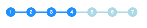
<li>1</li>
<li>2</li>
<li>3</li>
<li class="active">4</li>
<li>5</li>
<li>6</li>
<li>7</li>
<li>8</li>
</ul>
<ul>
  <li>1</li>
  <li>2</li>
  <li>3</li>
  <li class="active">4</li>
  <li>5</li>
  <li>6</li>
  <li>7</li>
</ul>
<ul>
<li>1</li>
<li>2</li>
<li>3</li>
<li class="active">4</li>
<li>5</li>
<li>6</li>
</ul>
<ul>
<li>1</li>
<li>2</li>
<li>3</li>
<li class="active">4</li>
<li>5</li>
</ul>
<ul>
<li>1</li>
<li class="active">2</li>
<li>3</li>
<li>4</li>
</ul>
<ul>
<li>1</li>
<li class="active">2</li>
<li>3</li>
</ul>
<ul>
<li class="active">1</li>
<li>2</li>
</ul>
<ul>
<li class="active">1</li>
</ul>Warning: date(): Invalid date.timezone value 'Europe/Kyiv', we selected the timezone 'UTC' for now. in /var/www/agent_stack/data/www/doraprojects.net/template/agent.layouts/content.php on line 54
2020-07-23 14:19:23
Przykład zrobiłem na podstawie odpowiedzi: https://codepen.io/Smakosh/pen/ZvvyMg
Pug
ul
  li.list.active 1
  li.list 2
  li.list 3
  li.list 4
Sass
ul
  list-style: none
    li
      display: inline-block
      width: 4rem
      height: 4rem
      line-height: 4rem
      border-radius: 100%
      background: #d8d8d8
      margin-right: 2rem
      position: relative
      &:first-child
        margin-left: unset
        &:before
          display: none
      &:before
        content: ''
        width: 2.4rem
        background-color: #d8d8d8
        height: 2px
        position: absolute
        top: 2rem
        right: 3.9rem
    .active
      background: #03A9F4
      color: #fff
      &:before
        background-color: #03A9F4
Warning: date(): Invalid date.timezone value 'Europe/Kyiv', we selected the timezone 'UTC' for now. in /var/www/agent_stack/data/www/doraprojects.net/template/agent.layouts/content.php on line 54
2018-05-24 16:00:31
Cóż, to jest mnóstwo znaczników, ale można zrobić coś takiego:
Użyj display: table-cell;, ponieważ automatycznie dostosuje szerokość elementów do wypełnienia przestrzeni.
Następnie, mają zbiór elementów koła i zbiór elementów linii. Elementy linii mają tylko dolną granicę, a elementy okręgu są po prostu relatywnie ustawione w dół, aby wyrównać się do linii.
Zauważ, że okręgi muszą mieć dodatkowy pojemnik, w przeciwnym razie table-cell rozciągnie wszystkie okręgi do ten sam wzrost, a ty nie chcesz tego. Będzie to wymagało ustawienia szerokości tych kontenerów na 1px, co zmusi je do rozmiaru potomka.
Zobacz to demo:
Warning: date(): Invalid date.timezone value 'Europe/Kyiv', we selected the timezone 'UTC' for now. in /var/www/agent_stack/data/www/doraprojects.net/template/agent.layouts/content.php on line 54
2013-10-28 22:26:30
Użyłem Bootstrap 4 i FontAwesome, aby zrobić moją wersję tego.
Oto kod pióra: [link] https://codepen.io/tr4c355/pen/roBjWV
HTML & CSS:
<style>
.line-btw {
  height:3px;
  width:100px;
  background-color: orange;
}
</style>
<div class="fa-stack fa-lg text-center">
  <i class="fa fa-circle-o fa-stack-2x"></i>
  <div class=""><b>1</b></div>
</div>
<div class="line-btw"></div>
<div class="fa-stack fa-lg text-center" style="">
  <i class="fa fa-circle-o fa-stack-2x"></i>
  <div style=""><b>2</b></div>
</div>
<div class="line-btw"></div>
<div class="fa-stack fa-lg text-center" style="">
  <i class="fa fa-circle-o fa-stack-2x"></i>
  <div class=""><b>3</b></div>
</div>
Warning: date(): Invalid date.timezone value 'Europe/Kyiv', we selected the timezone 'UTC' for now. in /var/www/agent_stack/data/www/doraprojects.net/template/agent.layouts/content.php on line 54
2018-12-07 16:34:44