Jak zrobić płynną przerywaną animację rotacji obramowania jak "maszerujące mrówki"
Pracuję nad animacją css, która wykorzystuje "tryby i łańcuchy", ale nie jestem w stanie stworzyć "gładkiej" sekwencji obrócenia obramowania.
Możesz zobaczyć w tym fiddle Jak (obecnie) używam pseudo elementu do generowania efektu "rotacji". Odbywa się to poprzez "przełączanie" między przerywaną białą i przerywaną złotą obwódką, co sprawia wrażenie "obraca się".
Co mam
#one{
  -webkit-animation: rotateClockwiseAnimation 5s linear infinite; /* Safari 4+ */
  -moz-animation:    rotateClockwiseAnimation 5s linear infinite; /* Fx 5+ */
  -o-animation:      rotateClockwiseAnimation 5s linear infinite; /* Opera 12+ */
  animation:         rotateClockwiseAnimation 5s linear infinite; /* IE 10+, Fx 29+ */

}
#two{
  -webkit-animation: rotateAntiClockwiseAnimation 5s linear infinite; /* Safari 4+ */
  -moz-animation:    rotateAntiClockwiseAnimation 5s linear infinite; /* Fx 5+ */
  -o-animation:      rotateAntiClockwiseAnimation 5s linear infinite; /* Opera 12+ */
  animation:         rotateAntiClockwiseAnimation 5s linear infinite; /* IE 10+, Fx 29+ */

 position:absolute;
    top:30px;
    left:42px;
    width:80px;
}

@-webkit-keyframes rotateClockwiseAnimation {
  0%   { transform: rotate(0deg); }
  100% { transform: rotate(360deg); }
}
@-moz-keyframes rotateClockwiseAnimation{
  0%   { transform: rotate(0deg); }
  100% { transform: rotate(360deg); }
}
@-o-keyframes rotateClockwiseAnimation {
  0%   { transform: rotate(0deg); }
  100% { transform: rotate(360deg); }
}
@keyframes rotateClockwiseAnimation {
  0%   { transform: rotate(0deg); }
  100% { transform: rotate(360deg); }
}

@-webkit-keyframes rotateAntiClockwiseAnimation {
  0%   { transform: rotate(0deg); }
  100% { transform: rotate(-360deg); }
}
@-moz-keyframes rotateAntiClockwiseAnimation {
  0%   { transform: rotate(0deg); }
  100% { transform: rotate(-360deg); }
}
@-o-keyframes rotateAntiClockwiseAnimation {
  0%   { transform: rotate(0deg); }
  100% { transform: rotate(-360deg); }
}
@keyframes rotateAntiClockwiseAnimation {
  0%   { transform: rotate(0deg); }
  100% { transform: rotate(-360deg); }
}

/******************************************************************************/

.chain{
    height:70px;
    width:80%;
    border:5px dashed gold;
    border-radius:30px;
    position:absolute;
    top:30px;
    left:40px;
          -webkit-animation: switchGoldBlackBorder 0.8s infinite; /* Safari 4+ */
  -moz-animation:    switchGoldBlackBorder 0.8s infinite; /* Fx 5+ */
  -o-animation:      switchGoldBlackBorder 0.8s infinite; /* Opera 12+ */
  animation:         switchGoldBlackBorder 0.8s infinite; /* IE 10+, Fx 29+ */
}


@-webkit-keyframes switchBlackGoldBorder {
    0%   { border: 5px dashed transparent; }
    49%   { border: 5px dashed transparent; }
    50%   { border: 5px dashed gold; }
    100%   { border: 5px dashed gold; }
}
@-moz-keyframes switchBlackGoldBorder{
    0%   { border: 5px dashed transparent; }
    49%   { border: 5px dashed transparent; }
    50%   { border: 5px dashed gold; }
    100%   { border: 5px dashed gold; }
}
@-o-keyframes switchBlackGoldBorder {
    0%   { border: 5px dashed transparent; }
    49%   { border: 5px dashed transparent; }
    50%   { border: 5px dashed gold; }
    100%   { border: 5px dashed gold; }
}
@keyframes switchBlackGoldBorder {
    0%   { border: 5px dashed transparent; }
    49%   { border: 5px dashed transparent; }
    50%   { border: 5px dashed gold; }
    100%   { border: 5px dashed gold; }
}


.chain:after{
    content:"";
    position:absolute;
    height:70px;
    border-radius:30px;
    width:100%;
    top:-5px;
    left:-5px;
    border:5px solid gold;
    z-index:-1;
          -webkit-animation: switchBlackGoldBorder 0.8s infinite; /* Safari 4+ */
  -moz-animation:    switchBlackGoldBorder 0.8s infinite; /* Fx 5+ */
  -o-animation:      switchBlackGoldBorder 0.8s infinite; /* Opera 12+ */
  animation:         switchBlackGoldBorder 0.8s infinite; /* IE 10+, Fx 29+ */
}

@-webkit-keyframes switchGoldBlackBorder {
  0%   { border: 5px solid gold; }
    49%   { border: 5px solid gold; }
    50%   { border: 5px solid white; }
    100%   { border: 5px solid white; }
}
@-moz-keyframes switchGoldBlackBorder{
  0%   { border: 5px solid gold; }
    49%   { border: 5px solid gold; }
    50%   { border: 5px solid white; }
    100%   { border: 5px solid white; }
}
@-o-keyframes switchGoldBlackBorder {
  0%   { border: 5px solid gold; }
    49%   { border: 5px solid gold; }
    50%   { border: 5px solid white; }
    100%   { border: 5px solid white; }
}
@keyframes switchGoldBlackBorder {
    0%   { border: 5px solid gold; }
    49%   { border: 5px solid gold; }
    50%   { border: 5px solid white; }
    100%   { border: 5px solid white; }
}
<svg id="one" style="width:50px" xmlns="http://www.w3.org/2000/svg" viewbox="0 0 100 100">
<defs>
<circle id="c" cx="50" cy="50" r="30" stroke="#808080" fill="none" stroke-width="25"/>
<path id="d" stroke="#808080" stroke-width="16" d="M50 0, V15 M50 100, V85 M0 50, H15 M100 50, H85"/>
</defs>
<use xlink:href="#c"/>
<use xlink:href="#d"/>
<use xlink:href="#d" transform="rotate(45, 50, 50)"/>
</svg>
<svg id="two" xmlns="http://www.w3.org/2000/svg" viewbox="0 0 100 100">
<use xlink:href="#one"/>
</svg>
<div class="chain"></div>Więc, niższe w części fragmentu możesz zobaczyć, jak wygenerowałem efekt "obracającego się łańcucha" za pomocą klatek kluczowych.
Co chciałbym
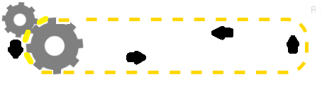
Moim ogólnym życzeniem byłoby wygenerować coś w stylu:
pomyśl o przekroju taśmy przenośnika i o tym, jak "koła zębate na końcu napędzają taśmę". Próbuję to odtworzyć. (tzn. złote bity przerywanej granicy powinny znajdować się w korytach biegu i "być ciągnięte" przez it)
#one{
  -webkit-animation: rotateClockwiseAnimation 5s linear infinite; /* Safari 4+ */
  -moz-animation:    rotateClockwiseAnimation 5s linear infinite; /* Fx 5+ */
  -o-animation:      rotateClockwiseAnimation 5s linear infinite; /* Opera 12+ */
  animation:         rotateClockwiseAnimation 5s linear infinite; /* IE 10+, Fx 29+ */
border:5px dashed gold;
  border-radius:50%;
}

@-webkit-keyframes rotateClockwiseAnimation {
  0%   { transform: rotate(0deg); }
  100% { transform: rotate(360deg); }
}
@-moz-keyframes rotateClockwiseAnimation{
  0%   { transform: rotate(0deg); }
  100% { transform: rotate(360deg); }
}
@-o-keyframes rotateClockwiseAnimation {
  0%   { transform: rotate(0deg); }
  100% { transform: rotate(360deg); }
}
@keyframes rotateClockwiseAnimation {
  0%   { transform: rotate(0deg); }
  100% { transform: rotate(360deg); }
}
<svg id="one" style="width:50px" xmlns="http://www.w3.org/2000/svg" viewbox="0 0 100 100">
<defs>
<circle id="c" cx="50" cy="50" r="30" stroke="#808080" fill="none" stroke-width="25"/>
<path id="d" stroke="#808080" stroke-width="16" d="M50 0, V15 M50 100, V85 M0 50, H15 M100 50, H85"/>
</defs>
<use xlink:href="#c"/>
<use xlink:href="#d"/>
<use xlink:href="#d" transform="rotate(45, 50, 50)"/>
</svg>Na koniec chciałbym wygenerować coś takiego:
Widzisz, jak chcę, aby łańcuch się "obracał"?
Moje Aktualne Problemy
- ponieważ animacja jest "zhakowana" za pomocą pseudo elementu, uważam, że dość trudno jest zsynchronizować obrót tego "łańcucha". Wciąż uczę się animacji klatek kluczowych, więc jestem pewien, że nie jest to najlepsza metoda na to.]} Svg jest dla mnie nową koncepcją, więc niechęć do używania go (stąd, dlaczego używam css do 'łańcucha')
- W końcu chcę, aby wyglądało to tak, jakby bieg obracał łańcuch, ale teraz wyglądają jak całkowicie (i źle zrobione) animacje oddzielnych elementów
6 answers
Animacja trybików i łańcuchów:
W sumie zrefakturowałem kod ( CSS i HTML ), Teraz jest:
- shorter (especial the css)
- prostsze [[18]} bardziej realistyczne: Poprawiono problem z synchronizacją pomiędzy łańcuchem i zębami i dodano brakującą zębatkę po prawej stronie, ponieważ twój łańcuch wydawał się unosić w powietrzu: [19]}
Podejście jest takie samo, animując kąt obrotu dla tryby i {[7] } dla ścieżki łańcucha. Poprawiłem czas między obiema animacjami, aby wyglądało to tak, jakby tryby ciągnęły łańcuch.
Obsługa przeglądarki:
Ponieważ IE nie obsługuje elementu svg animate, wykonałem również tę wersję animacji za pomocą przystawki .biblioteka svg , która również obsługuje IE9 i więcej(testowana w IE9 z crossbrowsertesting ).
DEMO z IE wsparcie
var cont   = new Snap('#svg'),
    chain  = cont.select('#chain'),
    cogAcw = cont.select('#cog_acw'),
    cogCw  = cont.select('#cog_cw'),
    speed  = 500;  // Lower this number to make the animation faster

function infChain(el) {
    var len = el.getTotalLength();
    el.attr({"stroke-dasharray": len/62,"stroke-dashoffset": 0});
    el.animate({"stroke-dashoffset": -len/31}, speed, mina.linear, infChain.bind(null, el));
}
function rotateAcw(el) {
    el.transform('r22.5,20,20');
    el.animate({ transform: 'r-22.5,20,20' }, speed, mina.linear, rotateAcw.bind( null, el));
}
function rotateCw(el) {
    el.transform('r0,20,20');
    el.animate({ transform: 'r45,20,20' }, speed, mina.linear, rotateCw.bind( null, el));
}
infChain(chain);
rotateAcw(cogAcw);
rotateCw(cogCw);
svg {
width:100%;
}<script src="http://thisisa.simple-url.com/js/snapsvg.js"></script>
<svg id="svg" xmlns="http://www.w3.org/2000/svg" viewbox="0 0 100 30">
<defs>
<circle id="c" cx="20" cy="20" r="4" stroke="#808080" fill="none" stroke-width="4" />
<path id="d" stroke="#808080" stroke-width="2" d="M20 13 V16 M27 20 H24 M20 27 V24 M13 20 H16" />
<g id="cog_acw">
<use xlink:href="#c" /><use xlink:href="#d" />
<use xlink:href="#d" transform="rotate(45 20 20)" />
</g>
<g id="cog_cw">
<use xlink:href="#c" /><use xlink:href="#d" />
<use xlink:href="#d" transform="rotate(45 20 20)" />
</g>
</defs>
<path id="chain" stroke-width="1" stroke="#000" fill="transparent"
d="M21.3 13.5 H20 C11.4 13.5 11.4 26.5 20 26.5 H80 C89.4 26.5 89.4 13.5 80.8 13.5z" />
<use xlink:href="#cog_acw" />
<use transform="translate(60.5 0), rotate(19,20,20)" xlink:href="#cog_acw" />
<use transform="translate(-4.5 -4.5),scale(.8), rotate(0,20,20)" xlink:href="#cog_cw" />
</svg>svg{width:100%;}
#chain_st{
-webkit-animation: dash 1s infinite linear;
-moz-animation: dash 1s infinite linear;
-o-animation: dash 1s infinite linear;
animation: dash 1s infinite linear;
}
@-webkit-keyframes dash {
to { stroke-dashoffset: -5; }
}
@-moz-keyframes dash {
to { stroke-dashoffset: -5; }
}
@-o-keyframes dash {
to { stroke-dashoffset: -5; }
}
@keyframes dash {
to { stroke-dashoffset: -5; }
}<svg id="one" xmlns="http://www.w3.org/2000/svg" viewbox="0 0 100 30">
<defs>
<circle id="c" cx="20" cy="20" r="4" stroke="#808080" fill="none" stroke-width="4"/>
<path id="d" stroke="#808080" stroke-width="2" d="M20 13 V16 M27 20 H24 M20 27 V24 M13 20 H16"/>
<g id="cog">
<use xlink:href="#c"/>
<use xlink:href="#d"/>
<use xlink:href="#d" transform="rotate(45 20 20)"/>
</g>
</defs>
<g transform="translate(0,-7), scale(0.8), rotate(22.5 8 8)">
<use xlink:href="#cog">
<animateTransform attributeType="xml" attributeName="transform" type="rotate" from="-22.5 20 20" to="337.5 20 20" dur="8s" repeatCount="indefinite"/>
</use>
</g>
<path id="chain_st" stroke-width="1" stroke="#000" fill="transparent" stroke-dasharray="2.6 2.45" d="M21.3 13.5 H20 C11.4 13.5 11.4 26.5 20 26.5 H80 C89 26.5 89 13.5 80.8 13.5z" />
<use class="rot" xlink:href="#cog">
<animateTransform attributeType="xml" attributeName="transform" type="rotate"from="22.5 20 20" to="-337.5 20 20" dur="8s" repeatCount="indefinite"/>
</use>
<g transform="translate(60.3 0)">
<use class="" xlink:href="#cog">
<animateTransform attributeType="xml" attributeName="transform" type="rotate" from="22.5 20 20" to="-337.5 20 20" dur="8s" repeatCount="indefinite"/>
</use>
</g>
</svg>Oryginalna odpowiedź:
Można użyć innej ścieżki przerywanej svg i animować właściwość dash-offset animacją klatki kluczowej.
To może i powinno być uproszczone/poprawione do użytku w "prawdziwym świecie":- Wszystkie elementy mogą być zawarte w jednym znaczniku
<svg>(byłoby to prostsze i oba cogs + chain mogłyby zmienić rozmiar razem) - synchronizacja między łańcuchem i trybikiem nie jest idealna, A Prędkość / rozmiar łańcucha musi zostać poprawiona.
#one {
  -webkit-animation: rotateClockwiseAnimation 5s linear infinite;
  /* Safari 4+ */
  -moz-animation: rotateClockwiseAnimation 5s linear infinite;
  /* Fx 5+ */
  -o-animation: rotateClockwiseAnimation 5s linear infinite;
  /* Opera 12+ */
  animation: rotateClockwiseAnimation 5s linear infinite;
  /* IE 10+, Fx 29+ */
}
#two {
  -webkit-animation: rotateAntiClockwiseAnimation 5s linear infinite;
  /* Safari 4+ */
  -moz-animation: rotateAntiClockwiseAnimation 5s linear infinite;
  /* Fx 5+ */
  -o-animation: rotateAntiClockwiseAnimation 5s linear infinite;
  /* Opera 12+ */
  animation: rotateAntiClockwiseAnimation 5s linear infinite;
  /* IE 10+, Fx 29+ */
  position: absolute;
  top: 30px;
  left: 42px;
  width: 80px;
}
@-webkit-keyframes rotateClockwiseAnimation {
  0% {
    transform: rotate(0deg);
  }
  100% {
    transform: rotate(360deg);
  }
}
@-moz-keyframes rotateClockwiseAnimation {
  0% {
    transform: rotate(0deg);
  }
  100% {
    transform: rotate(360deg);
  }
}
@-o-keyframes rotateClockwiseAnimation {
  0% {
    transform: rotate(0deg);
  }
  100% {
    transform: rotate(360deg);
  }
}
@keyframes rotateClockwiseAnimation {
  0% {
    transform: rotate(0deg);
  }
  100% {
    transform: rotate(360deg);
  }
}
@-webkit-keyframes rotateAntiClockwiseAnimation {
  0% {
    transform: rotate(0deg);
  }
  100% {
    transform: rotate(-360deg);
  }
}
@-moz-keyframes rotateAntiClockwiseAnimation {
  0% {
    transform: rotate(0deg);
  }
  100% {
    transform: rotate(-360deg);
  }
}
@-o-keyframes rotateAntiClockwiseAnimation {
  0% {
    transform: rotate(0deg);
  }
  100% {
    transform: rotate(-360deg);
  }
}
@keyframes rotateAntiClockwiseAnimation {
  0% {
    transform: rotate(0deg);
  }
  100% {
    transform: rotate(-360deg);
  }
}
/******************************************************************************/

#chain {
  width: 650px;
  position: absolute;
  top: 24px;
  left: 35px;
}
.chain_st {
  stroke-dasharray: 1.5;
  stroke-dashoffset: 10;
  -webkit-animation: dash 18s infinite linear;
  -moz-animation: dash 18s infinite linear;
  -o-animation: dash 18s infinite linear;
  animation: dash 18s infinite linear;
}
@-webkit-keyframes dash {
  to {
    stroke-dashoffset: 100;
  }
}
@-moz-keyframes dash {
  to {
    stroke-dashoffset: 100;
  }
}
@-o-keyframes dash {
  to {
    stroke-dashoffset: 100;
  }
}
keyframes dash {
  to {
    stroke-dashoffset: 100;
  }
}
<svg id="one" style="width:50px" xmlns="http://www.w3.org/2000/svg" viewbox="0 0 100 100">
<defs>
<circle id="c" cx="50" cy="50" r="30" stroke="#808080" fill="none" stroke-width="25" />
<path id="d" stroke="#808080" stroke-width="16" d="M50 0, V15 M50 100, V85 M0 50, H15 M100 50, H85" />
</defs>
<use xlink:href="#c" />
<use xlink:href="#d" />
<use xlink:href="#d" transform="rotate(45, 50, 50)" />
</svg>
<svg id="two" xmlns="http://www.w3.org/2000/svg" viewbox="0 0 100 100">
<use xlink:href="#one" />
</svg>
<svg id="chain" xmlns="http://www.w3.org/2000/svg" viewbox="0 0 70 10">
<path class="chain_st" stroke-width="0.5" stroke="#000" fill="transparent" d="M60 1 Q65 1 65 5 Q65 9 60 9 H6 Q1 9 1 5 Q1 1 6 1z" />
</svg>Warning: date(): Invalid date.timezone value 'Europe/Kyiv', we selected the timezone 'UTC' for now. in /var/www/agent_stack/data/www/doraprojects.net/template/agent.layouts/content.php on line 54
2015-02-25 13:21:15
Co powiesz na takie podejście? Używam SVG zarówno do przekładni, jak i przenośnika. Koła zębate obracają się jak na przykładzie, ale używam stroke-dasharray i animuję stroke-dash-offset, aby przenieść taśmę przenośnika.
Trzeba było trochę pokręcić, aby uzyskać właściwą długość przenośnika i rozstaw osi, które trzeba będzie ponownie dostosować, jeśli zmienisz rozmiar przekładni lub długość przenośnika.
#one{
  -webkit-animation: rotateClockwiseAnimation 4s linear infinite; /* Safari 4+ */
  -moz-animation:    rotateClockwiseAnimation 4s linear infinite; /* Fx 5+ */
  -o-animation:      rotateClockwiseAnimation 4s linear infinite; /* Opera 12+ */
  animation:         rotateClockwiseAnimation 4s linear infinite; /* IE 10+, Fx 29+ */

}
#two{
  -webkit-animation: rotateAntiClockwiseAnimation 4s linear infinite; /* Safari 4+ */
  -moz-animation:    rotateAntiClockwiseAnimation 4s linear infinite; /* Fx 5+ */
  -o-animation:      rotateAntiClockwiseAnimation 4s linear infinite; /* Opera 12+ */
  animation:         rotateAntiClockwiseAnimation 4s linear infinite; /* IE 10+, Fx 29+ */

 position:absolute;
    top:30px;
    left:42px;
    width:80px;
}

@-webkit-keyframes rotateClockwiseAnimation {
  0%   { transform: rotate(0deg); }
  100% { transform: rotate(360deg); }
}
@-moz-keyframes rotateClockwiseAnimation{
  0%   { transform: rotate(0deg); }
  100% { transform: rotate(360deg); }
}
@-o-keyframes rotateClockwiseAnimation {
  0%   { transform: rotate(0deg); }
  100% { transform: rotate(360deg); }
}
@keyframes rotateClockwiseAnimation {
  0%   { transform: rotate(0deg); }
  100% { transform: rotate(360deg); }
}

@-webkit-keyframes rotateAntiClockwiseAnimation {
  0%   { transform: rotate(0deg); }
  100% { transform: rotate(-360deg); }
}
@-moz-keyframes rotateAntiClockwiseAnimation {
  0%   { transform: rotate(0deg); }
  100% { transform: rotate(-360deg); }
}
@-o-keyframes rotateAntiClockwiseAnimation {
  0%   { transform: rotate(0deg); }
  100% { transform: rotate(-360deg); }
}
@keyframes rotateAntiClockwiseAnimation {
  0%   { transform: rotate(0deg); }
  100% { transform: rotate(-360deg); }
}


/******************************************************************************/

#chain
{
  -webkit-animation: conveyor 0.5s linear infinite; /* Safari 4+ */
  -moz-animation:    conveyor 0.5s linear infinite; /* Fx 5+ */
  -o-animation:      conveyor 0.5s linear infinite; /* Opera 12+ */
  animation:         conveyor 0.5s linear infinite; /* IE 10+, Fx 29+ */
}


@-webkit-keyframes conveyor {
    0%   { stroke-dashoffset: -9; }
    100% { stroke-dashoffset: 20.06; }
}
@-moz-keyframes conveyor {
    0%   { stroke-dashoffset: -9; }
    100% { stroke-dashoffset: 20.06; }
}
@-o-keyframes conveyor {
    0%   { stroke-dashoffset: -9; }
    100% { stroke-dashoffset: 20.06; }
}
@keyframes conveyor {
    0%   { stroke-dashoffset: -9; }
    100% { stroke-dashoffset: 20.06; }
}
<svg width="100%" xmlns="http://www.w3.org/2000/svg" viewbox="0 0 800 100">
<defs>
<circle id="c" cx="0" cy="0" r="30" stroke="#808080" fill="none" stroke-width="25"/>
<path id="d" stroke="#808080" stroke-width="16" d="M0,-50 v15 M0,50 v-15 M-50,0 h15 M50,0 h-15"/>
<g id="gear">
<use xlink:href="#c"/>
<use xlink:href="#d"/>
<use xlink:href="#d" transform="rotate(45)"/>
</g>
</defs>
<rect id="chain2"
x="43" y="23" width="598" height="74" rx="37"
stroke="gold" stroke-width="2" fill="none"/>
<g transform="translate(27,27) scale(0.5)">
<g id="one">
<use xlink:href="#gear"/>
</g>
</g>
<g transform="translate(80,60) scale(0.8)">
<g id="two">
<use xlink:href="#gear"/>
</g>
</g>
<rect id="chain"
x="43" y="23" width="598" height="74" rx="37"
stroke="gold" stroke-width="5" fill="none"
stroke-dasharray="14 15.06"/>
</svg>Warning: date(): Invalid date.timezone value 'Europe/Kyiv', we selected the timezone 'UTC' for now. in /var/www/agent_stack/data/www/doraprojects.net/template/agent.layouts/content.php on line 54
2015-02-24 17:01:10
Uwaga: przerobiłem całą animację w box-shadow, ponieważ używanie przerywanych ramek nie ma spójnego wyjścia we wszystkich przeglądarkach.
Praca
.. i działa między przeglądarkami.
FF 5+, GC 4+, IE9+, Safari 4+, Opera 12.1+
Możesz tego spróbować używając box-shadow:
Aby Zębatki zębate, użyj box-shadow z ujemnym promieniem rozprzestrzeniania. Rozmiar mojego sprzętu był
50pxna przykład, więc aby obejśćbox-shadowzd=8px, użyłem-46pxjako promień rozprzestrzeniania.Ustawiłem zęby za pomocą współrzędnych geo i użyłem tylko 8 zębów, aby uprościć.
-
Teraz dla prostego przenośnika, musimy znać odległość między zębami. Otrzymujemy to przez:
2*pi*(gear radius) / no. of teeth=(pi * r) / 4
moje =(55 * 3.1415) / 4 = 43(ok.)
Wziąłem Promień jako 55 bo zęby mają promień 4px i leżą 1px od biegu Obwód.Aby wyrównać górne i dolne proste przenośniki, muszą być tłumaczone dowolną wielokrotnością ich odległości. Dla mojego sprzętu tłumaczę je przez 43px.
Rusztowania
body {
    background: rgba(25,80,175, 0.4);
}
.rect {
    height: 116px;
    width: 401px;
    border-radius: 58px;
    position: relative;
    overflow: hidden;
}

.rect:before, .rect:after {
    content: '';
    position: absolute;
    left: 46px; /*50-half width*/
    height: 8px;
    width: 8px;
    border-radius: 50%;
    background: transparent;
    box-shadow: 43px 0 0 0 white, 86px 0 0 0 white, 129px 0 0 0 white, 172px 0 0 0 white, 215px 0 0 0 white, 258px 0 0 0 white, 301px 0 0 0 white;
    -webkit-animation: apple 0.3s linear infinite;
    -moz-animation: apple 0.3s linear infinite;
    animation: apple 0.3s linear infinite;
}
.rect:before {
    top: 0px;
}
.rect:after {
    bottom: 0px;
    -webkit-animation-direction: reverse;
    -moz-animation-direction: reverse;
    animation-direction: reverse;
}
@-webkit-keyframes apple {
    0% {-webkit-transform: translatex(0px);}
    100% {-webkit-transform: translateX(-43px);}
}
@-moz-keyframes apple {
    0% {-moz-transform: translatex(0px);}
    100% {-moz-transform: translateX(-43px);}
}
@keyframes apple {
    0% {transform: translatex(0px);}
    100% {transform: translateX(-43px);}
}
.left, .right {
    content: '';
    position: relative;
    height: 100px;
    width: 100px;
    border-radius: 50px;
    background-color: #222;
    box-shadow: 0 55px 0 -46px white, 55px 0 0 -46px white, 0 -55px 0 -46px white, -55px 0 0 -46px white,
        39px 39px 0 -46px white, -39px -39px 0 -46px white, 39px -39px 0 -46px white, -39px 39px 0 -46px white;
    -webkit-animation: mango 2.4s linear infinite;
    -moz-animation: mango 2.4s linear infinite;
    animation: mango 2.4s linear infinite;
}
.left {
    top: -108px;
    left: 0px;
}
.right {
    top: -208px;
    left: 301px;
}
@-webkit-keyframes mango {
    0% {-webkit-transform: rotate(0deg);}
    100% {-webkit-transform: rotate(-360deg);}
}
@-moz-keyframes mango {
    0% {-moz-transform: rotate(0deg);}
    100% {-moz-transform: rotate(-360deg);}
}
@keyframes mango {
    0% {transform: rotate(0deg);}
    100% {transform: rotate(-360deg);}
}
<div class="rect"></div>
<div class="left"></div>
<div class="right"></div>Wersja ostateczna
... z przekładniami. łańcuch aktualnie jest przerywany / align = "left" /
body {
    background-color: white;
}
.rect {
    height: 120px;
    width: 401px;
    border-radius: 58px;
    position: relative;
}

.rect:before, .rect:after {
    content: '';
    position: absolute;
    left: 40px; /*50-half width*/
    height: 10px;
    width: 20px;
    background: transparent;
    box-shadow: 43px 0 0 0 gold, 86px 0 0 0 gold, 129px 0 0 0 gold, 172px 0 0 0 gold, 215px 0 0 0 gold, 258px 0 0 0 gold, 301px 0 0 0 gold, 344px 0 0 0 gold; /*keep adding 43 to x-axis*/
    -webkit-animation: apple 0.6s linear infinite;
    -moz-animation: apple 0.6s linear infinite;
    animation: apple 0.6s linear infinite;
    overflow: hidden;
}
.rect:before {
    top: 0px;
}
.rect:after {
    bottom: 0px;
    -webkit-animation-direction: reverse;
    -moz-animation-direction: reverse;
    animation-direction: reverse;
}
@-webkit-keyframes apple {
    0% {-webkit-transform: translatex(0px);}
    100% {-webkit-transform: translateX(-43px);}
}
@-moz-keyframes apple {
    0% {-moz-transform: translatex(0px);}
    100% {-moz-transform: translateX(-43px);}
}
@keyframes apple {
    0% {transform: translatex(0px);}
    100% {transform: translateX(-43px);}
}
.left, .right {
    content: '';
    position: relative;
    height: 100px;
    width: 100px;
    border-radius: 50px;
    -webkit-animation: mango 4.8s linear infinite;
    -moz-animation: mango 4.8s linear infinite;
    animation: mango 4.8s linear infinite;
}
.left {
    top: -110px;
    left: 0px;
}
.right {
    top: -210px;
    left: 344px;
}
.left:before, .left:after, .right:before, .right:after {
    height: 20px;
    width: 20px;
    content: '';
    position: absolute;
    background-color: gold;
}
.left:before, .right:before {
    box-shadow: 50px 50px 0 0 gold, -50px 50px 0 0 gold, 0 100px 0 0 gold;
    top: -10px;
    left: 40px;
}
.left:after, .right:after {
    transform: rotate(45deg);
    top: 5px;
    left: 76px;
    box-shadow: 0px 100px 0 0 gold, 50px 50px 0 0 gold, -50px 50px 0 0 gold;
}
@-webkit-keyframes mango {
    0% {-webkit-transform: rotate(0deg);}
    100% {-webkit-transform: rotate(-360deg);}
}
@-moz-keyframes mango {
    0% {-moz-transform: rotate(0deg);}
    100% {-moz-transform: rotate(-360deg);}
}
@keyframes mango {
    0% {transform: rotate(0deg);}
    100% {transform: rotate(-360deg);}
}
.cover {
    height: 104px;
    width: 446px;
    border-radius: 50px;
    position: relative;
    background: rgba(255,255,255,1);
    top: -312px;
    left; -2px;

}
.gear, .gear2 {
    height: 100px;
    width: 100px;
    background: dimgray;
    border-radius: 50%;
    position: relative;
    -webkit-animation: gear 4.8s linear infinite;
    -moz-animation: gear 4.8s linear infinite;
    animation: gear 4.8s linear infinite;
}
.gear {
    top: -414px;

}
.gear2 {
    top: -514px;
    left: 345px;
}
.gear:before, .gear:after, .gear2:before, .gear2:after {
    height: 20px;
    width: 20px;
    content: '';
    position: absolute;
    background-color: dimgray;

}
.gear:before, .gear2:before {
    box-shadow: 50px 50px 0 0 dimgray, -50px 50px 0 0 dimgray, 0 100px 0 0 dimgray;
    top: -10px;
    left: 40px;
}
.gear:after, .gear2:after {
    transform: rotate(45deg);
    top: 5px;
    left: 76px;
    box-shadow: 0px 100px 0 0 dimgray, 50px 50px 0 0 dimgray, -50px 50px 0 0 dimgray;
}
@-webkit-keyframes gear {
    0% {-webkit-transform: rotate(22.5deg);}
    100% {-webkit-transform: rotate(-337.5deg);}
}
@-moz-keyframes gear {
    0% {-moz-transform: rotate(22.5deg);}
    100% {-moz-transform: rotate(-337.5deg);}
}
@keyframes gear {
    0% {transform: rotate(22.5deg);}
    100% {transform: rotate(-337.5deg);}
}
<div class="rect"></div>
<div class="left"></div>
<div class="right"></div>
<div class="cover"></div>
<div class="gear"></div>
<div class="gear2"></div>Wersja ostateczna (zaokrąglone zębate zęby)
.rect {
    height: 120px;
    width: 401px;
    border-radius: 58px;
    position: relative;
}
.rect:before, .rect:after {
    content: '';
    position: absolute;
    left: 40px; /*50-half width*/
    height: 10px;
    width: 20px;
    box-shadow: 43px 0 0 0 gold, 86px 0 0 0 gold, 129px 0 0 0 gold, 172px 0 0 0 gold, 215px 0 0 0 gold, 258px 0 0 0 gold, 301px 0 0 0 gold, 344px 0 0 0 gold; /*keep adding 43 to x-axis*/
    -webkit-animation: translate 0.6s linear infinite;
    -moz-animation: translate 0.6s linear infinite;
    animation: translate 0.6s linear infinite;
    overflow: hidden;
}
.rect:before {top: 0px;}
.rect:after {
    bottom: 0px;
    -webkit-animation-direction: reverse;
    -moz-animation-direction: reverse;
    animation-direction: reverse;
}
@-webkit-keyframes translate {
    0% {-webkit-transform: translatex(0px);}
    100% {-webkit-transform: translateX(-43px);}
}
@-moz-keyframes translate {
    0% {-moz-transform: translatex(0px);}
    100% {-moz-transform: translateX(-43px);}
}
@keyframes translate {
    0% {transform: translatex(0px);}
    100% {transform: translateX(-43px);}
}
.left, .right {
    position: relative;
    height: 100px;
    width: 100px;
    border-radius: 50px;
    -webkit-animation: rotate 4.8s linear infinite;
    -moz-animation: rotate 4.8s linear infinite;
    animation: rotate 4.8s linear infinite;
}
.left {
    top: -110px; left: 0px;
}
.right {
    top: -210px; left: 344px;
}
.left:before, .left:after, .right:before, .right:after {
    height: 20px;
    width: 20px;
    content: '';
    position: absolute;
    background: gold;
}
.left:before, .right:before {
    box-shadow: 50px 50px 0 0 gold, -50px 50px 0 0 gold, 0 100px 0 0 gold;
    top: -10px;
    left: 40px;
}
.left:after, .right:after {
    transform: rotate(45deg);
    top: 5px;
    left: 76px;
    box-shadow: 0px 100px 0 0 gold, 50px 50px 0 0 gold, -50px 50px 0 0 gold;
}
@-webkit-keyframes rotate {
    0% {-webkit-transform: rotate(0deg);}
    100% {-webkit-transform: rotate(-360deg);}
}
@-moz-keyframes rotate {
    0% {-moz-transform: rotate(0deg);}
    100% {-moz-transform: rotate(-360deg);}
}
@keyframes rotate {
    0% {transform: rotate(0deg);}
    100% {transform: rotate(-360deg);}
}
.cover {
    height: 104px;
    width: 446px;
    border-radius: 50px;
    position: relative;
    background: rgba(255,255,255,1);
    top: -312px;
    left; -2px;
}
.gear, .gear2, .gear3 {
    height: 100px;
    width: 100px;
    background: transparent;
    box-shadow: inset 0 0 0px 35px dimgray, inset 0 0 0px 40px #444;
    border-radius: 50%;
    position: relative;
    -webkit-animation: rotate 4.8s linear infinite;
    -moz-animation: rotate 4.8s linear infinite;
    animation: rotate 4.8s linear infinite;
    -webkit-animation-delay: 0.3s;
    -moz-animation-delay: 0.3s;
    animation-delay: 0.3s;
}
.gear {top: -414px;}
.gear2 {top: -514px; left: 345px;}
.gear:before, .gear:after, .gear2:before, .gear2:after,  .gear3:before, .gear3:after {
    height: 20px;
    width: 20px;
    content: '';
    border-radius: 20%;
    position: absolute;
    background: dimgray;
}
.gear:before, .gear2:before, .gear3:before {
    box-shadow: 50px 50px 0 0 dimgray, -50px 50px 0 0 dimgray, 0 100px 0 0 dimgray;
    top: -10px; left: 40px;
}
.gear:after, .gear2:after, .gear3:after {
    transform: rotate(45deg);
    top: 5px; left: 76px;
    box-shadow: 0px 100px 0 0 dimgray, 50px 50px 0 0 dimgray, -50px 50px 0 0 dimgray;
}
.gear3 {
    -webkit-animation-direction: reverse;
    -moz-animation-direction: reverse;
    animation-direction: reverse;
    top: -504px;
    -webkit-animation-delay: 0s;
    -moz-animation-delay: 0s;
    animation-delay: 0s;
}
<div class="rect"></div>
<div class="left"></div>
<div class="right"></div>
<div class="cover"></div>
<div class="gear"></div>
<div class="gear2"></div>
<div class="gear3"></div>Uwaga: aby zwiększyć szybkość animacji, wystarczy zmniejszyć czas animacji każdego elementu proporcjonalnie.
Warning: date(): Invalid date.timezone value 'Europe/Kyiv', we selected the timezone 'UTC' for now. in /var/www/agent_stack/data/www/doraprojects.net/template/agent.layouts/content.php on line 54
2015-02-28 10:32:32
Oto inna metoda na uzyskanie animacji cog za pomocą CSS. Metoda ta została przetestowana w IE11, IE10, Firefox, Chrome, Opera i Safari.
- dwa okrągłe elementy do kół zębatych/kół zębatych z wkładką
box-shadowdo wytworzenia wewnętrznego koła. Zęby są wytwarzane przez elementy dziecięce (normalne + pseudo), które są obracane wokół osi. - zakrzywiona część pasa jest osiągana tą samą techniką co szprychy koła zębatego i jest ustawiona w taki sposób, aby były zawsze między zębami.
- jeden prostokątny element kontenera, którego górna i dolna krawędź są naśladowane za pomocą gradientu liniowego. Tło tego elementu (inne niż gradient na górze i na dole) jest jednolitym kolorem, co jest swego rodzaju wadą. Ten jednolity kolor służy do ukrycia połowy okrągłego elementu po obu stronach.
- animacja jest osiągana na dwa sposoby (a) stale obracając zarówno elementy koliste, jak i (B) stale zmieniając położenie tła tła gradientowe.
.chain {
    margin: 45px auto;
    height: 100px;
    width: 310px;
    position: relative;
    background: -webkit-linear-gradient(0deg, gold 50%, transparent 50%), -webkit-linear-gradient(0deg, gold 50%, transparent 50%), white;
    background: -moz-linear-gradient(90deg, gold 50%, transparent 50%), -moz-linear-gradient(90deg, gold 50%, transparent 50%), white;
    background: linear-gradient(90deg, gold 50%, transparent 50%), linear-gradient(90deg, gold 50%, transparent 50%), white;
    background-size: 41px 5px;
    background-repeat: repeat-x;
    background-position: 20px 0px, 20px 95px;
    -webkit-animation: bgPos 1s infinite linear;
    -moz-animation: bgPos 1s infinite linear;
    animation: bgPos 1s infinite linear;
}
.belt, .belt-after, .belt .spokes, .belt .spokes:before, .belt .spokes:after, .belt-after .spokes, .belt-after .spokes:before, .belt-after .spokes:after {
    position: absolute;
    content:'';
    height: 90px;
    width:15px;
    top: 0px;
    border-top: 5px solid gold;
    border-bottom: 5px solid gold;
    z-index: -1;
}
.belt, .belt-after {
    -webkit-animation: borderAnim 8s infinite linear;
    -moz-animation: borderAnim 8s infinite linear;
    animation: borderAnim 8s infinite linear;
}
.belt .spokes, .belt-after .spokes {
    top: -5px;
    -webkit-transform: rotate(45deg);
    -moz-transform: rotate(45deg);
    transform: rotate(45deg);
}
.belt .spokes:before, .belt-after .spokes:before {
    top: -5px;
    -webkit-transform: rotate(90deg);
    -moz-transform: rotate(90deg);
    transform: rotate(90deg);
}
.belt .spokes:after, .belt-after .spokes:after {
    top: -5px;
    -webkit-transform: rotate(45deg);
    -moz-transform: rotate(45deg);
    transform: rotate(45deg);
}
.belt {
    left: -16px;
}
.belt-after {
    right: -16px;
}
.gear {
    content:'';
    position: absolute;
    top: 5px;
    height: 90px;
    width: 90px;
    border-radius: 50%;
    -webkit-animation: borderAnim 8s infinite linear;
    -moz-animation: borderAnim 8s infinite linear;
    animation: borderAnim 8s infinite linear;
    box-shadow: inset 0px 0px 0px 30px gray;
    z-index: 4;
}
.gear:before, .gear .spokes, .gear .spokes:before, .gear .spokes:after {
    position: absolute;
    content:'';
    height: 88px;
    width:15px;
    top: -5px;
    border-top: 6px solid gray;
    border-bottom: 6px solid gray;
}
.gear:before {
    left: 37px;
    -webkit-transform: rotate(22.5deg);
    -moz-transform: rotate(22.5deg);
    transform: rotate(22.5deg);
}
.gear .spokes {
    left: 37px;
    -webkit-transform: rotate(67.5deg);
    -moz-transform: rotate(67.5deg);
    transform: rotate(67.5deg);
}
.gear .spokes:before {
    top: -6px;
    -webkit-transform: rotate(45deg);
    -moz-transform: rotate(45deg);
    transform: rotate(45deg);
}
.gear .spokes:after {
    -webkit-transform: rotate(90deg);
    -moz-transform: rotate(90deg);
    transform: rotate(90deg);
}
.chain .belt + .gear {
    left:-52px;
}
.chain .belt-after + .gear {
    right: -52.5px;
}
.gear-small {
    content:'';
    position: absolute;
    left: -92px;
    top: -20px;
    height: 50px;
    width: 50px;
    border-radius: 50%;
    -webkit-animation: borderAnim 6s infinite linear reverse;
    -moz-animation: borderAnim 6s infinite linear reverse;
    animation: borderAnim 6s infinite linear reverse;
    box-shadow: inset 0px 0px 0px 20px gray;
    z-index: -2;
}
.gear-small:before {
    position: absolute;
    content:'';
    left: 21px;
    top: -3px;
    height: 48px;
    width: 10px;
    border-top:4px solid gray;
    border-bottom: 4px solid gray;
}
.gear-small .spokes, .gear-small .spokes:before, .gear-small .spokes:after {
    position: absolute;
    content:'';
    left: 21px;
    top: -3px;
    height: 48px;
    width: 10px;
    border-top:4px solid gray;
    border-bottom: 4px solid gray;
}
.gear-small .spokes {
    -webkit-transform: rotate(45deg);
    -moz-transform: rotate(45deg);
    transform: rotate(45deg);
}
.gear-small .spokes:before {
    left: 0px;
    -webkit-transform: rotate(90deg);
    -moz-transform: rotate(90deg);
    transform: rotate(90deg);
}
.gear-small .spokes:after {
    left: 0px;
    -webkit-transform: rotate(45deg);
    -moz-transform: rotate(45deg);
    transform: rotate(45deg);
}
@-webkit-keyframes borderAnim {
    0% {
        -webkit-transform: rotate(360deg);
    }
    100% {
        -webkit-transform: rotate(0deg);
    }
}
@-moz-keyframes borderAnim {
    0% {
        -moz-transform: rotate(360deg);
    }
    100% {
        -moz-transform: rotate(0deg);
    }
}
@keyframes borderAnim {
    0% {
        transform: rotate(360deg);
    }
    100% {
        transform: rotate(0deg);
    }
}
@-webkit-keyframes bgPos {
    0% {
        background-position: 20px 0px, -20px 95px;
    }
    100% {
        background-position: -20px 0px, 20px 95px;
    }
}
@-moz-keyframes bgPos {
    0% {
        background-position: 20px 0px, -20px 95px;
    }
    100% {
        background-position: -20px 0px, 20px 95px;
    }
}
@keyframes bgPos {
    0% {
        background-position: 20px 0px, -20px 95px;
    }
    100% {
        background-position: -20px 0px, 20px 95px;
    }
}
<div class="chain">
<div class="gear-small">
<div class="spokes"></div>
</div>
<div class="belt">
<div class="spokes"></div>
</div>
<div class="gear">
<div class="spokes"></div>
</div>
<div class="belt-after">
<div class="spokes"></div>
</div>
<div class="gear">
<div class="spokes"></div>
</div>
</div>Bonus: oto cała animacja z włącznikiem / wyłącznikiem:) kliknij (pociągnij) uchwyt łańcucha, aby włączyć lub wyłączyć animację.
.container {
position: relative;
}
.chain {
margin: 45px 100px;
height: 100px;
width: 310px;
position: relative;
background: -webkit-linear-gradient(0deg, gold 50%, transparent 50%), -webkit-linear-gradient(0deg, gold 50%, transparent 50%), white;
background: -moz-linear-gradient(90deg, gold 50%, transparent 50%), -moz-linear-gradient(90deg, gold 50%, transparent 50%), white;
background: linear-gradient(90deg, gold 50%, transparent 50%), linear-gradient(90deg, gold 50%, transparent 50%), white;
background-size: 41px 5px;
background-repeat: repeat-x;
background-position: 20px 0px, 20px 95px;
-webkit-animation: bgPos 1s infinite linear;
-moz-animation: bgPos 1s infinite linear;
animation: bgPos 1s infinite linear;
}
.belt,
.belt-after,
.belt .spokes,
.belt .spokes:before,
.belt .spokes:after,
.belt-after .spokes,
.belt-after .spokes:before,
.belt-after .spokes:after {
position: absolute;
height: 90px;
width: 15px;
top: 0px;
border-top: 5px solid gold;
border-bottom: 5px solid gold;
z-index: -1;
}
.belt,
.belt-after {
-webkit-animation: borderAnim 8s infinite linear;
-moz-animation: borderAnim 8s infinite linear;
animation: borderAnim 8s infinite linear;
}
.belt .spokes,
.belt-after .spokes {
top: -5px;
-webkit-transform: rotate(45deg);
-moz-transform: rotate(45deg);
transform: rotate(45deg);
}
.belt .spokes:before,
.belt .spokes:after,
.belt-after .spokes,
.belt-after .spokes:before,
.belt-after .spokes:after {
content: '';
}
.belt .spokes:before,
.belt-after .spokes:before {
top: -5px;
-webkit-transform: rotate(90deg);
-moz-transform: rotate(90deg);
transform: rotate(90deg);
}
.belt .spokes:after,
.belt-after .spokes:after {
top: -5px;
-webkit-transform: rotate(45deg);
-moz-transform: rotate(45deg);
transform: rotate(45deg);
}
.belt {
left: -16px;
}
.belt-after {
right: -16px;
}
.gear {
position: absolute;
top: 5px;
height: 90px;
width: 90px;
border-radius: 100%;
-webkit-animation: borderAnim 8s infinite linear;
-moz-animation: borderAnim 8s infinite linear;
animation: borderAnim 8s infinite linear;
box-shadow: inset 0px 0px 0px 30px gray, inset 0px 0px 0px 40px white, inset 0px 0px 0px 50px tomato;
z-index: 4;
}
.gear:before,
.gear .spokes,
.gear .spokes:before,
.gear .spokes:after {
position: absolute;
content: '';
height: 88px;
width: 15px;
top: -5px;
border-top: 6px solid gray;
border-bottom: 6px solid gray;
}
.gear:before {
left: 37px;
-webkit-transform: rotate(22.5deg);
-moz-transform: rotate(22.5deg);
transform: rotate(22.5deg);
}
.gear .spokes {
left: 37px;
-webkit-transform: rotate(67.5deg);
-moz-transform: rotate(67.5deg);
transform: rotate(67.5deg);
}
.gear .spokes:before {
top: -6px;
-webkit-transform: rotate(45deg);
-moz-transform: rotate(45deg);
transform: rotate(45deg);
}
.gear .spokes:after {
-webkit-transform: rotate(90deg);
-moz-transform: rotate(90deg);
transform: rotate(90deg);
}
.chain .belt + .gear {
left: -52px;
}
.chain .belt-after + .gear {
right: -52.5px;
}
.gear-small {
position: absolute;
left: -91px;
top: -20px;
height: 50px;
width: 50px;
border-radius: 50%;
-webkit-animation: borderAnim 8s 0.4s infinite linear;
-moz-animation: borderAnim 6s infinite linear;
animation: borderAnim 6s infinite linear;
-webkit-animation-direction: reverse;
-moz-animation-direction: reverse;
animation-direction: reverse;
box-shadow: inset 0px 0px 0px 20px gray;
z-index: -2;
}
.gear-small:before {
position: absolute;
content: '';
left: 21px;
top: -3px;
height: 48px;
width: 10px;
border-top: 4px solid gray;
border-bottom: 4px solid gray;
}
.gear-small .spokes,
.gear-small .spokes:before,
.gear-small .spokes:after {
position: absolute;
content: '';
left: 21px;
top: -3px;
height: 48px;
width: 10px;
border-top: 4px solid gray;
border-bottom: 4px solid gray;
}
.gear-small .spokes {
-webkit-transform: rotate(45deg);
-moz-transform: rotate(45deg);
transform: rotate(45deg);
}
.gear-small .spokes:before {
left: 0px;
-webkit-transform: rotate(90deg);
-moz-transform: rotate(90deg);
transform: rotate(90deg);
}
.gear-small .spokes:after {
left: 0px;
-webkit-transform: rotate(45deg);
-moz-transform: rotate(45deg);
transform: rotate(45deg);
}
@-webkit-keyframes borderAnim {
0% {
-webkit-transform: rotate(360deg);
}
100% {
-webkit-transform: rotate(0deg);
}
}
@-moz-keyframes borderAnim {
0% {
-moz-transform: rotate(360deg);
}
100% {
-moz-transform: rotate(0deg);
}
}
@keyframes borderAnim {
0% {
transform: rotate(360deg);
}
100% {
transform: rotate(0deg);
}
}
@-webkit-keyframes bgPos {
0% {
background-position: 20px 0px, -20px 95px;
}
100% {
background-position: -20px 0px, 20px 95px;
}
}
@-moz-keyframes bgPos {
0% {
background-position: 20px 0px, -20px 95px;
}
100% {
background-position: -20px 0px, 20px 95px;
}
}
@keyframes bgPos {
0% {
background-position: 20px 0px, -20px 95px;
}
100% {
background-position: -20px 0px, 20px 95px;
}
}
#pull-switch {
display: none;
/* no need to display checkbox */
}
#switch {
position: absolute;
left: 77px;
top: 50px;
border-right: 2px dotted tomato;
height: 200px;
width: 15px;
-webkit-transition: height 0.5s;
-moz-transition: height 0.5s;
transition: height 0.5s;
z-index: 10;
}
#handle {
display: block;
position: absolute;
/* left: width of chain div (15px) + half of border (1px) - radius of handle (8px)*/
left: 8px;
bottom: 0%;
background-color: tomato;
width: 16px;
height: 16px;
border-radius: 50%;
cursor: pointer
}
#pull-switch:checked + #switch > #handle {
background-color: seagreen;
}
#pull-switch:checked + #switch {
height: 225px;
border-color: seagreen;
}
#pull-switch ~ .chain .gear-small,
#pull-switch ~ .chain .belt,
#pull-switch ~ .chain .belt-after,
#pull-switch ~ .chain .gear,
#pull-switch ~ .chain {
-webkit-animation-play-state: paused;
-moz-animation-play-state: paused;
animation-play-state: paused;
}
#pull-switch:checked ~ .chain .gear-small,
#pull-switch:checked ~ .chain .belt,
#pull-switch:checked ~ .chain .belt-after,
#pull-switch:checked ~ .chain .gear,
#pull-switch:checked ~ .chain {
-webkit-animation-play-state: running;
-moz-animation-play-state: running;
animation-play-state: running;
}
#pull-switch:checked ~ .chain .belt + .gear,
#pull-switch:checked ~ .chain .belt-after + .gear {
box-shadow: inset 0px 0px 0px 30px gray, inset 0px 0px 0px 40px white, inset 0px 0px 0px 50px seagreen;
}<div class="container">
<input type="checkbox" id="pull-switch" />
<div id="switch">
<label for="pull-switch" id="handle"></label>
</div>
<div class="chain">
    <div class="gear-small">
        <div class="spokes"></div>
    </div>
    <div class="belt">
        <div class="spokes"></div>
    </div>
    <div class="gear">
        <div class="spokes"></div>
    </div>
    <div class="belt-after">
        <div class="spokes"></div>
    </div>
    <div class="gear">
        <div class="spokes"></div>
    </div>
</div>
</div>Oryginalna odpowiedź: (nie działa na Firefoksie ze względu na przerywany błąd granicy, a myślniki są bardziej bliższe w IE, co sprawia, że wygląda brzydko).
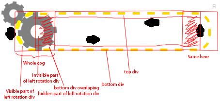
Można uzyskać animację rotacji obramowania za pomocą kombinacji po:
- dwa okrągłe elementy (za pomocą
border-radius: 50%) z przerywaną obwódką po obu stronach, tworząc zakrzywioną część obramowania. - jeden prostokątny element kontenera, którego górna i dolna krawędź są naśladowane za pomocą
linear-gradient. Tło tego elementu (inne niż gradient na górze i na dole) jest jednolitym kolorem, co jest swego rodzaju wadą. Ten jednolity kolor służy do ukrycia połowy okrągłego elementu po obu stronach. - animacja jest osiągana na dwa sposoby (a) stale obracając zarówno elementy kołowe, jak i (B) stale zmieniając
background-positiontła gradientu. - tryby są również okrągłymi elementami, w których szprychy są wykonane z przerywanymi krawędziami, a solidna część wewnętrzna jest generowana za pomocą wkładki
box-shadow. Koło zębate jest obracane w taki sposób, że granica łańcucha zawsze znajduje się pomiędzy granicą koła zębatego.
.chain {
  margin: 45px auto;
  height: 100px;
  width: 300px;
  position: relative;
  background: -webkit-linear-gradient(0deg, gold 50%, transparent 50%), -webkit-linear-gradient(0deg, gold 50%, transparent 50%), white;
  background: -moz-linear-gradient(90deg, gold 50%, transparent 50%), -moz-linear-gradient(90deg, gold 50%, transparent 50%), white;
  background: linear-gradient(90deg, gold 50%, transparent 50%), linear-gradient(90deg, gold 50%, transparent 50%), white;
  background-size: 30px 5px;
  background-repeat: repeat-x;
  background-position: 0px 0px, 5px 95px;
  -webkit-animation: bgPos 4s infinite linear;
  -moz-animation: bgPos 4s infinite linear;
  animation: bgPos 4s infinite linear;
}
.chain .before,
.chain .after {
  position: absolute;
  content: '';
  height: 90px;
  width: 90px;
  top: 0px;
  border-radius: 50%;
  border: 5px dashed gold;
  -webkit-animation: borderAnim 2s infinite linear;
  -moz-animation: borderAnim 2s infinite linear;
  animation: borderAnim 2s infinite linear;
  z-index: -2;
}
.chain .before {
  left: -45px;
}
.chain .after {
  right: -45px;
}
.chain .gear {
  content: '';
  position: absolute;
  top: 0px;
  height: 90px;
  width: 90px;
  border-radius: 50%;
  border: 5px dashed gray;
  -webkit-transform: rotate(16deg);
  -moz-transform: rotate(16deg);
  transform: rotate(16deg);
  -webkit-animation: gearAnim 2s infinite linear;
  -moz-animation: gearAnim 2s infinite linear;
  animation: gearAnim 2s infinite linear;
  box-shadow: inset 0px 0px 0px 30px gray;
  z-index: 4;
}
.chain .before + .gear {
  left: -45px;
}
.chain .after + .gear {
  right: -45px;
}
.gear-small {
  content: '';
  position: absolute;
  left: -95px;
  top: -23px;
  height: 60px;
  width: 60px;
  border-radius: 50%;
  border: 3px dashed gray;
  -webkit-transform: rotate(16deg);
  -moz-transform: rotate(16deg);
  transform: rotate(16deg);
  -webkit-animation: gearAnim 6s infinite linear reverse;
  -moz-animation: gearAnim 6s infinite linear reverse;
  animation: gearAnim 6s infinite linear reverse;
  box-shadow: inset 0px 0px 0px 20px gray;
  z-index: -2;
}
@-webkit-keyframes borderAnim {
  0% {
    -webkit-transform: rotate(360deg);
  }
  100% {
    -webkit-transform: rotate(0deg);
  }
}
@-moz-keyframes borderAnim {
  0% {
    -moz-transform: rotate(360deg);
  }
  100% {
    -moz-transform: rotate(0deg);
  }
}
@keyframes borderAnim {
  0% {
    transform: rotate(360deg);
  }
  100% {
    transform: rotate(0deg);
  }
}
@-webkit-keyframes bgPos {
  0% {
    background-position: 610px 0px, 0px 95px;
  }
  100% {
    background-position: 0px 0px, 600px 95px;
  }
}
@-moz-keyframes bgPos {
  0% {
    background-position: 610px 0px, 0px 95px;
  }
  100% {
    background-position: 0px 0px, 600px 95px;
  }
}
@keyframes bgPos {
  0% {
    background-position: 610px 0px, 0px 95px;
  }
  100% {
    background-position: 0px 0px, 600px 95px;
  }
}
@-webkit-keyframes gearAnim {
  0% {
    -webkit-transform: rotate(376deg);
  }
  100% {
    -webkit-transform: rotate(16deg);
  }
}
@-moz-keyframes gearrAnim {
  0% {
    -moz-transform: rotate(376deg);
  }
  100% {
    -moz-transform: rotate(16deg);
  }
}
@keyframes gearAnim {
  0% {
    transform: rotate(376deg);
  }
  100% {
    transform: rotate(16deg);
  }
}
<div class="chain">
<div class="gear-small"></div>
<div class="before"></div>
<div class="gear"></div>
<div class="after"></div>
<div class="gear"></div>
</div>Wreszcie, ale nie mniej ważne, nadal polecam stosowanie podejścia SVG do tego, bo poza pewnym punktem takie animacje z CSS stałyby się bardzo niechlujne:)
Warning: date(): Invalid date.timezone value 'Europe/Kyiv', we selected the timezone 'UTC' for now. in /var/www/agent_stack/data/www/doraprojects.net/template/agent.layouts/content.php on line 54
2015-03-13 14:16:34
Możesz spróbować edytować tryby, aby lepiej pasowały zamiast poprawiać obramowanie div, aby dopasować się do tryby. Łatwiej manipulować grafiką niż css.
A stamtąd może podzielić animację łańcucha na trzy lub cztery części, aby była bardziej wytrzymała.
Następnie można dostosować prędkości cog i łańcucha dopasować, ukryć połowę łańcucha, dodać do niego div tylko z górnej i dolnej granicy i zrobić to samo, ale odwrotnie na drugim końcu. (za pomocą clipingu, position i z-index).
Coś tak:
Przynajmniej teoretycznie, to byłoby moje podejście(nie wspominając, że użyłbym JS zamiast tego workflow).
Warning: date(): Invalid date.timezone value 'Europe/Kyiv', we selected the timezone 'UTC' for now. in /var/www/agent_stack/data/www/doraprojects.net/template/agent.layouts/content.php on line 54
2015-02-24 11:19:12
Używanie Płótna
Kształty (trybik i łańcuch) oraz efekt animacji mrówek (przerywana Granica) można również uzyskać za pomocą rysunku płótna. Obsługa przeglądarki dla Canvas jest całkiem dobra.
Chociaż Canvas ma tę wadę, że jest oparty na rastrze (w przeciwieństwie do SVG, który opiera się na kształtach), nie jest to duży problem, o ile płótno nie jest zbytnio skalowane. Oczekuje się, że płótno będzie lepsze podczas obsługi dużej liczby obiektów i w czasie rzeczywistym animacje. tutaj {[29] } jest ciekawy artykuł z MSDN na temat Kiedy używać Canvas lub SVG.
Budowa kształtów
W tej animacji znajdują się następujące kluczowe części/kształty:]}- Łańcuch
- Lewy Cog
- Prawy Cog
- Top Cog
Łańcuch : łańcuch jest tworzony przez narysowanie dwóch poziomych linii (za pomocą poleceń lineTo), które są połączone na obu końcach średnikami (narysowane za pomocą arc dowództwo). Efekt przerywanej granicy uzyskuje się za pomocą metody setLineDash dla obrysu. setLineDash metoda przyjmuje dwa parametry, gdzie pierwszy reprezentuje długość myślnika, a drugi reprezentuje odstęp między myślnikami.
Poniższy fragment pokazuje minimalny kod wymagany do utworzenia łańcucha:
window.onload = function() {
  var canvas = document.getElementById('canvas');
  var ctx = canvas.getContext('2d');
  var chain = {
    offset: 0,
    paint: function() {
      ctx.beginPath();
      ctx.moveTo(75, 50);
      ctx.lineTo(533, 50);
      ctx.arc(533, 100, 50, (Math.PI * 1.5), (Math.PI * 0.5), false);
      ctx.lineTo(75, 150);
      ctx.arc(75, 100, 50, (Math.PI * 0.5), (Math.PI * 1.5), false);
      ctx.lineWidth = 5;
      ctx.fillStyle = 'transparent';
      ctx.setLineDash([12, 14.16]);
      ctx.lineDashOffset = this.offset;
      ctx.fill();
      ctx.stroke();
    }
  };

  chain.paint();
}
/* CSS needed only for demo */
body {
background-image: radial-gradient(circle, #3F9CBA 0%, #153346 100%);
}
canvas {
margin: 50px auto;
}<canvas id='canvas' width='650' height='300'></canvas>Cogs : wszystkie trzy tryby (lewy, prawy i górny) są osiągane za pomocą tych samych poleceń, a jedyną różnicą jest ich położenie na ekran (i promień dla górnego).
Szprychy lub zęby kół zębatych są tworzone za pomocą polecenia arc (Jak to robi się dla półkul łańcucha) i używają tego samego promienia. Ich lineDashoffset jest regulowana w taki sposób, aby zajmowały dokładną przestrzeń pozostałą między kreseczkami łańcucha.
evenodd parametr fill służy do ustawienia koloru tła (tan w tym przykład) tylko na zewnętrznym okręgu i pozostawiając wewnętrzny przezroczysty.
Poniżej urywek pokazuje minimalny kod wymagany do utworzenia trybików:
window.onload = function() {
  var canvas = document.getElementById('canvas');
  var ctx = canvas.getContext('2d');
  var cog = {
    paint: function(x, y, r, offset) {
      ctx.beginPath();
      ctx.arc(x, y, r, 0, Math.PI * 2, true);
      ctx.closePath();
      ctx.lineWidth = 5;
      ctx.setLineDash([12, 14.16]);
      ctx.lineDashOffset = offset;
      ctx.strokeStyle = 'tan';
      ctx.stroke();
      ctx.beginPath();
      ctx.arc(x, y, (r - 2), 0, Math.PI * 2, true);
      ctx.arc(x, y, (r / 2.5), 0, Math.PI * 2, true);
      ctx.closePath();
      ctx.fillStyle = 'tan';
      ctx.fill('evenodd');
    }
  };

  function paint() {
    var cog_radius = 50;
    var cog_t_x = 30,
      cog_t_y = 40,
      cog_t_offset = 20.5,
      cog_l_x = 75,
      cog_l_y = 100,
      cog_l_offset = 24.25,
      cog_r_x = 533,
      cog_r_offset = 11.25;
    ctx.clearRect(0, 0, canvas.width, canvas.height);
    ctx.save();
    cog.paint(cog_t_x, cog_t_y, (cog_radius / 2), cog_t_offset);
    ctx.restore();
    ctx.save();
    cog.paint(cog_l_x, cog_l_y, cog_radius, cog_l_offset);
    ctx.restore();
    ctx.save();
    cog.paint(cog_r_x, cog_l_y, cog_radius, cog_r_offset);
    ctx.restore();
  }
  paint();

}
/* CSS needed only for demo */
body {
background-image: radial-gradient(circle, #3F9CBA 0%, #153346 100%);
}
canvas {
margin: 50px auto;
}<canvas id='canvas' width='650' height='300'></canvas>Animacja
Animacja jest osiągana przez przesunięcie lineDashOffset pociągnięć w każdej klatce animacji. Sama animacja jest wyzwalana za pomocą window.requestAnimationFrame metoda wywołująca funkcję paint (przekazywaną jako argument) w regularnych odstępach czasu. Wskaźnik oddzwaniania jest zwykle 60 razy na sekundę (cytując MDN). Przesunięcie przesunięcia podczas każdego przemalowania płótna sprawia wrażenie animowanego.
Animację można zatrzymać w dowolnym momencie, wywołując cancelAnimationFrame metoda. Można to zrobić albo na podstawie interakcji użytkownika (jak kliknięcie, najechanie kursorem itp.), lub na podstawie czasu.
window.onload = function() {
  var canvas = document.getElementById('canvas');
  var ctx = canvas.getContext('2d');
  var anim, onState = false,
    counter = 0;
  var chain = {
    offset: 0,
    paint: function() {
      ctx.beginPath();
      ctx.moveTo(75, 50);
      ctx.lineTo(533, 50);
      ctx.arc(533, 100, 50, (Math.PI * 1.5), (Math.PI * 0.5), false);
      ctx.lineTo(75, 150);
      ctx.arc(75, 100, 50, (Math.PI * 0.5), (Math.PI * 1.5), false);
      ctx.lineWidth = 5;
      ctx.fillStyle = 'transparent';
      ctx.setLineDash([12, 14.16]);
      ctx.lineDashOffset = this.offset;
      ctx.fill();
      ctx.stroke();
    }
  };

  function paint(type) {
    ctx.clearRect(0, 0, canvas.width, canvas.height);
    chain.offset += (6.54 / 10);
    ctx.save();
    chain.paint();
    ctx.restore();
    if (type) {
      anim = window.requestAnimationFrame(function() {
        paint(type);
      })
    }
  }
  paint(true);
}
/* CSS needed only for demo */
body {
background-image: radial-gradient(circle, #3F9CBA 0%, #153346 100%);
}
canvas {
margin: 50px auto;
}<canvas id='canvas' width='650' height='300'></canvas>Kompletny Obraz
Złożenie wszystkich części razem, poniższy fragment w przeciwieństwie do poprzednich części serii, nie jest to gra logiczna.]}
window.onload = function() {
  var canvas = document.getElementById('canvas');
  var ctx = canvas.getContext('2d');
  var anim, onState = false,
    counter = 0;
  var cog_radius = 50;
  var cog_t_x = 30,
    cog_t_y = 40,
    cog_t_offset = 20.5,
    cog_l_x = 75,
    cog_l_y = 100,
    cog_l_offset = 24.25,
    cog_r_x = 533,
    cog_r_offset = 11.25;
  var chain = {
    offset: 0,
    paint: function() {
      ctx.beginPath();
      ctx.moveTo(75, 50);
      ctx.lineTo(533, 50);
      ctx.arc(533, 100, 50, (Math.PI * 1.5), (Math.PI * 0.5), false);
      ctx.lineTo(75, 150);
      ctx.arc(75, 100, 50, (Math.PI * 0.5), (Math.PI * 1.5), false);
      ctx.lineWidth = 5;
      ctx.fillStyle = 'transparent';
      ctx.setLineDash([12, 14.16]);
      ctx.lineDashOffset = this.offset;
      ctx.fill();
      ctx.stroke();
    }
  };
  var cog = {
    paint: function(x, y, r, offset) {
      ctx.beginPath();
      ctx.arc(x, y, r, 0, Math.PI * 2, true);
      ctx.closePath();
      ctx.lineWidth = 5;
      ctx.setLineDash([12, 14.16]);
      ctx.lineDashOffset = offset;
      ctx.strokeStyle = 'tan';
      ctx.stroke();
      ctx.beginPath();
      ctx.arc(x, y, (r - 2), 0, Math.PI * 2, true);
      ctx.arc(x, y, (r / 2.5), 0, Math.PI * 2, true);
      ctx.closePath();
      ctx.fillStyle = 'tan';
      ctx.fill('evenodd');
    }
  };

  function paint(type) {
    ctx.clearRect(0, 0, canvas.width, canvas.height);
    chain.offset += (6.54 / 10);
    cog_l_offset -= (6.54 / 10);
    cog_r_offset -= (6.54 / 10);
    cog_t_offset += (6.54 / 10);
    ctx.save();
    cog.paint(cog_t_x, cog_t_y, (cog_radius / 2), cog_t_offset);
    ctx.restore();
    ctx.save();
    chain.paint();
    ctx.restore();
    ctx.save();
    cog.paint(cog_l_x, cog_l_y, cog_radius, cog_l_offset);
    ctx.restore();
    ctx.save();
    cog.paint(cog_r_x, cog_l_y, cog_radius, cog_r_offset);
    ctx.restore();
    if (type) {
      anim = window.requestAnimationFrame(function() {
        paint(type);
      })
    }
  }
  paint(true);
}
/* CSS needed only for demo */
body {
background-image: radial-gradient(circle, #3F9CBA 0%, #153346 100%);
}
canvas {
margin: 50px auto;
}<canvas id='canvas' width='650' height='300'></canvas>Interakcja Z Użytkownikiem
Jak wspomniano wcześniej, interakcja użytkownika może być również dodana za pomocą detektorów zdarzeń (addEventListener). Jeśli akcja musi zostać wywołana przez akcję użytkownika na określonym kształcie lub odcinku płótna, można użyć metody pointInPath do sprawdzenia, czy punkt znajduje się w wymaganej sekcji płótna.
Tutaj jest link do demo CodePen, które ma te interakcje użytkownika (i kilka innych dodatkowych rzeczy) również dodane.
Uwaga: Wyjaśnienie, jak dodawać interakcje z użytkownikami itp., wykracza poza zakres tej konkretnej odpowiedzi. Jeśli jednak potrzebujesz pomocy, możesz mnie znaleźć w tym czacie.
Warning: date(): Invalid date.timezone value 'Europe/Kyiv', we selected the timezone 'UTC' for now. in /var/www/agent_stack/data/www/doraprojects.net/template/agent.layouts/content.php on line 54
2021-01-18 12:34:40