Animowany posortowany wykres słupkowy z poprzeczkami wyprzedzającymi się nawzajem
Edit: keyword is 'bar chart race'
Jak zrobiłbyś reprodukcję tego wykresu z Jaime Albella W R ?
Zobacz animację na visualcapitalist.com lub na Twitterze (podając kilka odniesień w przypadku, gdy jedna się zepsuje).
Oznaczam to jako ggplot2 oraz gganimate ale wszystko, co można wyprodukować z R jest istotne.
Data (dzięki https://github.com/datasets/gdp )
gdp <- read.csv("https://raw.github.com/datasets/gdp/master/data/gdp.csv")
# remove irrelevant aggregated values
words <- scan(
  text="world income only total dividend asia euro america africa oecd",
  what= character())
pattern <- paste0("(",words,")",collapse="|")
gdp  <- subset(gdp, !grepl(pattern, Country.Name , ignore.case = TRUE))
Edit:
Kolejny fajny przykład z John Murdoch:
3 answers
Edit: dodano interpolację splajnu dla płynniejszych przejść, bez wprowadzania zmian rangi za szybko. Kod na dole.

Dostosowałem swoją odpowiedź do powiązanego pytania . Lubię używać geom_tile do animowanych pasków, ponieważ pozwala na przesuwanie pozycji.
Pracowałem nad tym przed dodaniem danych, ale tak się składa, że gapminder Dane, których użyłem, są ściśle ze sobą powiązane.

library(tidyverse)
library(gganimate)
library(gapminder)
theme_set(theme_classic())

gap <- gapminder %>%
  filter(continent == "Asia") %>%
  group_by(year) %>%
  # The * 1 makes it possible to have non-integer ranks while sliding
  mutate(rank = min_rank(-gdpPercap) * 1) %>%
  ungroup()

p <- ggplot(gap, aes(rank, group = country,
                     fill = as.factor(country), color = as.factor(country))) +
  geom_tile(aes(y = gdpPercap/2,
                height = gdpPercap,
                width = 0.9), alpha = 0.8, color = NA) +

  # text in x-axis (requires clip = "off" in coord_*)
  # paste(country, " ")  is a hack to make pretty spacing, since hjust > 1
  #   leads to weird artifacts in text spacing.
  geom_text(aes(y = 0, label = paste(country, " ")), vjust = 0.2, hjust = 1) +

  coord_flip(clip = "off", expand = FALSE) +
  scale_y_continuous(labels = scales::comma) +
  scale_x_reverse() +
  guides(color = FALSE, fill = FALSE) +

  labs(title='{closest_state}', x = "", y = "GFP per capita") +
  theme(plot.title = element_text(hjust = 0, size = 22),
        axis.ticks.y = element_blank(),  # These relate to the axes post-flip
        axis.text.y  = element_blank(),  # These relate to the axes post-flip
        plot.margin = margin(1,1,1,4, "cm")) +

  transition_states(year, transition_length = 4, state_length = 1) +
  ease_aes('cubic-in-out')

animate(p, fps = 25, duration = 20, width = 800, height = 600)
Dla gładsza wersja na górze, możemy dodać krok do interpolacji danych przed etapem kreślenia. Przydatne może być interpolowanie dwukrotnie, raz przy szorstkiej ziarnistości w celu ustalenia rankingu, a innym razem dla dokładniejszych szczegółów. Jeśli ranking zostanie obliczony zbyt drobno, słupki zmienią pozycję zbyt szybko.
gap_smoother <- gapminder %>%
  filter(continent == "Asia") %>%
  group_by(country) %>%
  # Do somewhat rough interpolation for ranking
  # (Otherwise the ranking shifts unpleasantly fast.)
  complete(year = full_seq(year, 1)) %>%
  mutate(gdpPercap = spline(x = year, y = gdpPercap, xout = year)$y) %>%
  group_by(year) %>%
  mutate(rank = min_rank(-gdpPercap) * 1) %>%
  ungroup() %>%

  # Then interpolate further to quarter years for fast number ticking.
  # Interpolate the ranks calculated earlier.
  group_by(country) %>%
  complete(year = full_seq(year, .5)) %>%
  mutate(gdpPercap = spline(x = year, y = gdpPercap, xout = year)$y) %>%
  # "approx" below for linear interpolation. "spline" has a bouncy effect.
  mutate(rank =      approx(x = year, y = rank,      xout = year)$y) %>%
  ungroup()  %>%
  arrange(country,year)
Następnie Wykres używa kilku zmodyfikowanych linii, w przeciwnym razie to samo:
p <- ggplot(gap_smoother, ...
  # This line for the numbers that tick up
  geom_text(aes(y = gdpPercap,
                label = scales::comma(gdpPercap)), hjust = 0, nudge_y = 300 ) +
  ...
  labs(title='{closest_state %>% as.numeric %>% floor}',
   x = "", y = "GFP per capita") +
...
transition_states(year, transition_length = 1, state_length = 0) +
enter_grow() +
exit_shrink() +
ease_aes('linear')

animate(p, fps = 20, duration = 5, width = 400, height = 600, end_pause = 10)
Warning: date(): Invalid date.timezone value 'Europe/Kyiv', we selected the timezone 'UTC' for now. in /var/www/agent_stack/data/www/doraprojects.net/template/agent.layouts/content.php on line 54
2019-11-10 03:38:20
To jest to, co wymyśliłem, do tej pory, opierając się w dobrej części na odpowiedzi @ Jon.
p <- gdp  %>%
  # build rank, labels and relative values
  group_by(Year) %>%
  mutate(Rank = rank(-Value),
         Value_rel = Value/Value[Rank==1],
         Value_lbl = paste0(" ",round(Value/1e9)))  %>%
  group_by(Country.Name) %>%
  # keep top 10
  filter(Rank <= 10) %>%
  # plot
  ggplot(aes(-Rank,Value_rel, fill = Country.Name)) +
  geom_col(width = 0.8, position="identity") +
  coord_flip() +
  geom_text(aes(-Rank,y=0,label = Country.Name,hjust=0)) +       #country label
  geom_text(aes(-Rank,y=Value_rel,label = Value_lbl, hjust=0)) + # value label
  theme_minimal() +
  theme(legend.position = "none",axis.title = element_blank()) +
  # animate along Year
  transition_states(Year,4,1)

animate(p, 100, fps = 25, duration = 20, width = 800, height = 600)

Poruszająca się siatka może być symulowana przez usunięcie rzeczywistej siatki i usunięcie geom_segment linii poruszających się i zanikających dzięki zmianie parametru Alfa, gdy zbliża się do 100 miliardów.
Aby etykiety zmieniały wartości między latami (co daje miłe uczucie pilności w oryginalnym wykresie) myślę, że nie mamy wyboru, ale mnożenie wierszy podczas interpolacji etykiet, musimy również interpolować rangę.
Wtedy z kilkoma drobnymi zmianami kosmetycznymi powinniśmy być dość blisko.
Warning: date(): Invalid date.timezone value 'Europe/Kyiv', we selected the timezone 'UTC' for now. in /var/www/agent_stack/data/www/doraprojects.net/template/agent.layouts/content.php on line 54
2018-11-06 02:06:49
To właśnie wymyśliłem, po prostu używam Jona i Moody code jako szablonu i wprowadzam kilka zmian.
library(tidyverse)
library(gganimate)
library(gapminder)
theme_set(theme_classic())
gdp <- read.csv("https://raw.github.com/datasets/gdp/master/data/gdp.csv")
words <- scan(
text="world income only total dividend asia euro america africa oecd",
what= character())
pattern <- paste0("(",words,")",collapse="|")
gdp <- subset(gdp, !grepl(pattern, Country.Name , ignore.case = TRUE))
colnames(gdp) <- gsub("Country.Name", "country", colnames(gdp))
colnames(gdp) <- gsub("Country.Code", "code", colnames(gdp))
colnames(gdp) <- gsub("Value", "value", colnames(gdp))
colnames(gdp) <- gsub("Year", "year", colnames(gdp))
gdp$value <- round(gdp$value/1e9)
gap <- gdp %>%
group_by(year) %>%
# The * 1 makes it possible to have non-integer ranks while sliding
mutate(rank = min_rank(-value) * 1,
Value_rel = value/value[rank==1],
Value_lbl = paste0(" ",value)) %>%
filter(rank <=10) %>%
ungroup()
p <- ggplot(gap, aes(rank, group = country,
fill = as.factor(country), color = as.factor(country))) +
geom_tile(aes(y = value/2,
height = value,
width = 0.9), alpha = 0.8, color = NA) +
geom_text(aes(y = 0, label = paste(country, " ")), vjust = 0.2, hjust = 1) +
geom_text(aes(y=value,label = Value_lbl, hjust=0)) +
coord_flip(clip = "off", expand = FALSE) +
scale_y_continuous(labels = scales::comma) +
scale_x_reverse() +
guides(color = FALSE, fill = FALSE) +
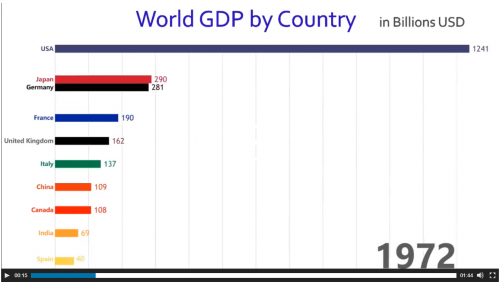
labs(title='{closest_state}', x = "", y = "GDP in billion USD",
caption = "Sources: World Bank | Plot generated by Nitish K. Mishra @nitishimtech") +
theme(plot.title = element_text(hjust = 0, size = 22),
axis.ticks.y = element_blank(), # These relate to the axes post-flip
axis.text.y = element_blank(), # These relate to the axes post-flip
plot.margin = margin(1,1,1,4, "cm")) +
transition_states(year, transition_length = 4, state_length = 1) +
ease_aes('cubic-in-out')
animate(p, 200, fps = 10, duration = 40, width = 800, height = 600, renderer = gifski_renderer("gganim.gif"))
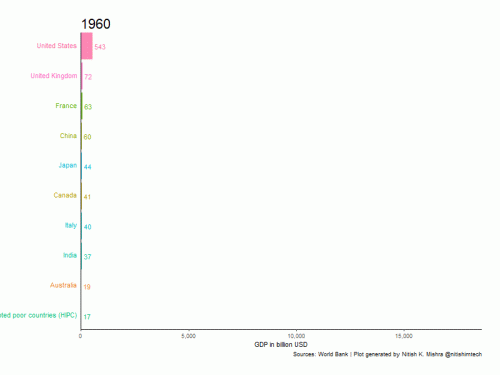 Tutaj używam czasu trwania 40 sekund, który jest powolny. Możesz zmienić czas trwania i uczynić go szybszym lub wolniejszym w zależności od potrzeb.
Warning: date(): Invalid date.timezone value 'Europe/Kyiv', we selected the timezone 'UTC' for now. in /var/www/agent_stack/data/www/doraprojects.net/template/agent.layouts/content.php on line 54
2019-01-17 15:46:30