Oś Drugorzędna z twinx (): jak dodać do legendy?
Mam Wykres z dwoma osiami y, używając twinx(). Podaję również etykiety do linii i chcę je pokazać za pomocą legend(), ale udaje mi się tylko uzyskać etykiety jednej osi w legendzie:
import numpy as np
import matplotlib.pyplot as plt
from matplotlib import rc
rc('mathtext', default='regular')

fig = plt.figure()
ax = fig.add_subplot(111)
ax.plot(time, Swdown, '-', label = 'Swdown')
ax.plot(time, Rn, '-', label = 'Rn')
ax2 = ax.twinx()
ax2.plot(time, temp, '-r', label = 'temp')
ax.legend(loc=0)
ax.grid()
ax.set_xlabel("Time (h)")
ax.set_ylabel(r"Radiation ($MJ\,m^{-2}\,d^{-1}$)")
ax2.set_ylabel(r"Temperature ($^\circ$C)")
ax2.set_ylim(0, 35)
ax.set_ylim(-20,100)
plt.show()
Więc dostaję tylko etykiety pierwszej osi w legendzie, a nie Etykietę "temp" drugiej osi. Jak Mogę dodać tę trzecią etykietę do legendy?
6 answers
Możesz łatwo dodać drugą legendę, dodając wiersz:
ax2.legend(loc=0)
Dostaniesz to:
Ale jeśli chcesz wszystkie etykiety na jednej legendzie to powinieneś zrobić coś takiego:
import numpy as np
import matplotlib.pyplot as plt
from matplotlib import rc
rc('mathtext', default='regular')

time = np.arange(10)
temp = np.random.random(10)*30
Swdown = np.random.random(10)*100-10
Rn = np.random.random(10)*100-10

fig = plt.figure()
ax = fig.add_subplot(111)

lns1 = ax.plot(time, Swdown, '-', label = 'Swdown')
lns2 = ax.plot(time, Rn, '-', label = 'Rn')
ax2 = ax.twinx()
lns3 = ax2.plot(time, temp, '-r', label = 'temp')

# added these three lines
lns = lns1+lns2+lns3
labs = [l.get_label() for l in lns]
ax.legend(lns, labs, loc=0)

ax.grid()
ax.set_xlabel("Time (h)")
ax.set_ylabel(r"Radiation ($MJ\,m^{-2}\,d^{-1}$)")
ax2.set_ylabel(r"Temperature ($^\circ$C)")
ax2.set_ylim(0, 35)
ax.set_ylim(-20,100)
plt.show()
Co da ci to:
Warning: date(): Invalid date.timezone value 'Europe/Kyiv', we selected the timezone 'UTC' for now. in /var/www/agent_stack/data/www/doraprojects.net/template/agent.layouts/content.php on line 54
2011-03-30 13:32:09
Nie jestem pewien, czy ta funkcjonalność jest nowa, ale możesz również użyć metody get_legend_handles_labels () zamiast samodzielnie śledzić linie i etykiety:
import numpy as np
import matplotlib.pyplot as plt
from matplotlib import rc
rc('mathtext', default='regular')
pi = np.pi
# fake data
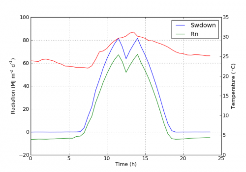
time = np.linspace (0, 25, 50)
temp = 50 / np.sqrt (2 * pi * 3**2) \
* np.exp (-((time - 13)**2 / (3**2))**2) + 15
Swdown = 400 / np.sqrt (2 * pi * 3**2) * np.exp (-((time - 13)**2 / (3**2))**2)
Rn = Swdown - 10
fig = plt.figure()
ax = fig.add_subplot(111)
ax.plot(time, Swdown, '-', label = 'Swdown')
ax.plot(time, Rn, '-', label = 'Rn')
ax2 = ax.twinx()
ax2.plot(time, temp, '-r', label = 'temp')
# ask matplotlib for the plotted objects and their labels
lines, labels = ax.get_legend_handles_labels()
lines2, labels2 = ax2.get_legend_handles_labels()
ax2.legend(lines + lines2, labels + labels2, loc=0)
ax.grid()
ax.set_xlabel("Time (h)")
ax.set_ylabel(r"Radiation ($MJ\,m^{-2}\,d^{-1}$)")
ax2.set_ylabel(r"Temperature ($^\circ$C)")
ax2.set_ylim(0, 35)
ax.set_ylim(-20,100)
plt.show()
Warning: date(): Invalid date.timezone value 'Europe/Kyiv', we selected the timezone 'UTC' for now. in /var/www/agent_stack/data/www/doraprojects.net/template/agent.layouts/content.php on line 54
2012-04-12 18:21:22
Możesz łatwo uzyskać to, co chcesz, dodając linię w ax:
ax.plot(0, 0, '-r', label = 'temp')
Lub
ax.plot(np.nan, '-r', label = 'temp')
To nic innego jak dodać etykietę do legend of ax.
Myślę, że to o wiele łatwiejszy sposób. Nie jest konieczne automatyczne śledzenie linii, gdy masz tylko kilka linii w drugiej osi, ponieważ ręczne mocowanie jak powyżej byłoby dość łatwe. W każdym razie, to zależy, czego potrzebujesz.Cały kod jest jak poniżej:
import numpy as np
import matplotlib.pyplot as plt
from matplotlib import rc
rc('mathtext', default='regular')
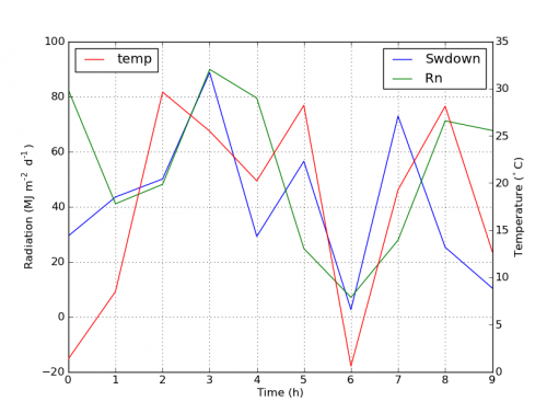
time = np.arange(22.)
temp = 20*np.random.rand(22)
Swdown = 10*np.random.randn(22)+40
Rn = 40*np.random.rand(22)
fig = plt.figure()
ax = fig.add_subplot(111)
ax2 = ax.twinx()
#---------- look at below -----------
ax.plot(time, Swdown, '-', label = 'Swdown')
ax.plot(time, Rn, '-', label = 'Rn')
ax2.plot(time, temp, '-r') # The true line in ax2
ax.plot(np.nan, '-r', label = 'temp') # Make an agent in ax
ax.legend(loc=0)
#---------------done-----------------
ax.grid()
ax.set_xlabel("Time (h)")
ax.set_ylabel(r"Radiation ($MJ\,m^{-2}\,d^{-1}$)")
ax2.set_ylabel(r"Temperature ($^\circ$C)")
ax2.set_ylim(0, 35)
ax.set_ylim(-20,100)
plt.show()
Fabuła jest jak poniżej:
Update: dodaj lepszą wersję:
ax.plot(np.nan, '-r', label = 'temp')
To nic nie da, podczas gdy {[4] } może zmienić zakres osi.
Warning: date(): Invalid date.timezone value 'Europe/Kyiv', we selected the timezone 'UTC' for now. in /var/www/agent_stack/data/www/doraprojects.net/template/agent.layouts/content.php on line 54
2017-05-08 12:28:36
Począwszy od wersji 2.1 matplotlib, można użyć legenda rysunku. Zamiast ax.legend(), która tworzy legendę za pomocą uchwytów z osi ax, można utworzyć legendę postaci
fig.legend(loc=1)
Który zbierze wszystkie uchwyty ze wszystkich podpunktów na rysunku. Ponieważ jest to legenda figury, zostanie ona umieszczona w rogu figury, a argument loc jest względem figury.
import numpy as np
import matplotlib.pyplot as plt

x = np.linspace(0,10)
y = np.linspace(0,10)
z = np.sin(x/3)**2*98

fig = plt.figure()
ax = fig.add_subplot(111)
ax.plot(x,y, '-', label = 'Quantity 1')

ax2 = ax.twinx()
ax2.plot(x,z, '-r', label = 'Quantity 2')
fig.legend(loc=1)

ax.set_xlabel("x [units]")
ax.set_ylabel(r"Quantity 1")
ax2.set_ylabel(r"Quantity 2")

plt.show()

W celu umieszczenia legendy z powrotem w osie, jeden dostarczałby bbox_to_anchor i bbox_transform. Ta ostatnia byłaby transformacją toporów, w których powinna znajdować się legenda. Pierwszą mogą być współrzędne krawędzi określone przez loc podane we współrzędnych osi.
fig.legend(loc=1, bbox_to_anchor=(1,1), bbox_transform=ax.transAxes)

Warning: date(): Invalid date.timezone value 'Europe/Kyiv', we selected the timezone 'UTC' for now. in /var/www/agent_stack/data/www/doraprojects.net/template/agent.layouts/content.php on line 54
2017-11-18 21:01:28
Szybki hack, który może odpowiadać Twoim potrzebom..
Zdejmij ramkę pudełka i ręcznie ustaw dwie legendy obok siebie. Coś w tym stylu..
ax1.legend(loc = (.75,.1), frameon = False)
ax2.legend( loc = (.75, .05), frameon = False)
Gdzie krotka loc to wartości procentowe od lewej do prawej i od dołu do góry, które reprezentują lokalizację na wykresie.
Warning: date(): Invalid date.timezone value 'Europe/Kyiv', we selected the timezone 'UTC' for now. in /var/www/agent_stack/data/www/doraprojects.net/template/agent.layouts/content.php on line 54
2015-10-05 20:28:51
Znalazłem następujący oficjalny przykład matplotlib, który używa host_subplot do wyświetlania wielu osi y i wszystkich różnych etykiet w jednej legendzie. Obejście nie jest konieczne. Najlepsze rozwiązanie, jakie do tej pory znalazłem. http://matplotlib.org/examples/axes_grid/demo_parasite_axes2.html
from mpl_toolkits.axes_grid1 import host_subplot
import mpl_toolkits.axisartist as AA
import matplotlib.pyplot as plt

host = host_subplot(111, axes_class=AA.Axes)
plt.subplots_adjust(right=0.75)

par1 = host.twinx()
par2 = host.twinx()

offset = 60
new_fixed_axis = par2.get_grid_helper().new_fixed_axis
par2.axis["right"] = new_fixed_axis(loc="right",
                                    axes=par2,
                                    offset=(offset, 0))

par2.axis["right"].toggle(all=True)

host.set_xlim(0, 2)
host.set_ylim(0, 2)

host.set_xlabel("Distance")
host.set_ylabel("Density")
par1.set_ylabel("Temperature")
par2.set_ylabel("Velocity")

p1, = host.plot([0, 1, 2], [0, 1, 2], label="Density")
p2, = par1.plot([0, 1, 2], [0, 3, 2], label="Temperature")
p3, = par2.plot([0, 1, 2], [50, 30, 15], label="Velocity")

par1.set_ylim(0, 4)
par2.set_ylim(1, 65)

host.legend()

plt.draw()
plt.show()
Warning: date(): Invalid date.timezone value 'Europe/Kyiv', we selected the timezone 'UTC' for now. in /var/www/agent_stack/data/www/doraprojects.net/template/agent.layouts/content.php on line 54
2015-03-17 14:15:53