Wyróżnij całą linię TreeViewItem w WPF
Jeśli ustawiam Tło TreeViewItem to podświetla tylko nagłówek. Jak wyróżnić całą linię?
Znalazłem post prawie rozwiązujący problem http://social.msdn.microsoft.com/Forums/en-US/wpf/thread/b04f73e2-0b10-4d97-a6da-64df2e30c21d/
Ale są pewne problemy: 1. Nie podkreśla całej linii 2. Drzewo ma styl XP Na Vista. Chciałbym żeby na Vistie wyglądał tak samo jak było, ale jeśli użytkownik zmienił motyw na XP-to powinien być XP sposób. 3. Tyle XAML...
Jakieś pomysły, czego mam szukać?
9 answers
Zaczynamy, trzeci raz uroku. Jeśli chcesz coś takiego.

<ControlTemplate TargetType="{x:Type TreeViewItem}">
  <ControlTemplate.Resources>
      <local:LeftMarginMultiplierConverter Length="19" x:Key="lengthConverter" />
  </ControlTemplate.Resources>
  <StackPanel>
        <Border Name="Bd"
          Background="{TemplateBinding Background}"
          BorderBrush="{TemplateBinding BorderBrush}"
          BorderThickness="{TemplateBinding BorderThickness}"
          Padding="{TemplateBinding Padding}">
            <Grid Margin="{Binding Converter={StaticResource lengthConverter},
                    RelativeSource={RelativeSource TemplatedParent}}">

                <Grid.ColumnDefinitions>
                    <ColumnDefinition Width="19" />
                    <ColumnDefinition />
                </Grid.ColumnDefinitions>
                <ToggleButton x:Name="Expander"
                    Style="{StaticResource ExpandCollapseToggleStyle}"
                    IsChecked="{Binding Path=IsExpanded,
                    RelativeSource={RelativeSource TemplatedParent}}"
                    ClickMode="Press"/>

                <ContentPresenter x:Name="PART_Header"
                    Grid.Column="1"
                    ContentSource="Header"
                    HorizontalAlignment="{TemplateBinding HorizontalContentAlignment}"/>
            </Grid>
      </Border>
      <ItemsPresenter x:Name="ItemsHost" />
    </StackPanel>
    <!-- Triggers -->
</ControlTemplate>
Rozszerzenie TreeViewDepth
public static class TreeViewItemExtensions
{
    public static int GetDepth(this TreeViewItem item)
    {
        TreeViewItem parent;
        while ((parent = GetParent(item)) != null)
        {
            return GetDepth(parent) + 1;
        }
        return 0;
    }

    private static TreeViewItem GetParent(TreeViewItem item)
    {
        var parent = VisualTreeHelper.GetParent(item);
        while (!(parent is TreeViewItem || parent is TreeView))
        {
            parent = VisualTreeHelper.GetParent(parent);
        }
        return parent as TreeViewItem;
    }
}
LeftMarginMultiplierConverter
public class LeftMarginMultiplierConverter : IValueConverter
{
    public double Length { get; set; }

    public object Convert(object value, Type targetType, object parameter, CultureInfo culture)
    {
        var item = value as TreeViewItem;
        if (item == null)
            return new Thickness(0);

        return new Thickness(Length * item.GetDepth(), 0, 0, 0);
    }

    public object ConvertBack(object value, Type targetType, object parameter, CultureInfo culture)
    {
        throw new System.NotImplementedException();
    }
}
Kontrola
<TreeView Margin="50" HorizontalContentAlignment="Stretch">
    <TreeViewItem Header="test2"/>
    <TreeViewItem Header="test2">
        <TreeViewItem Header="sub test">
            <TreeViewItem Header="sub test1-1"/>
            <TreeViewItem Header="sub test1-2"/>
        </TreeViewItem>
        <TreeViewItem Header="sub test2"/>
    </TreeViewItem>
    <TreeViewItem Header="test3"/>
</TreeView>
Full TreeViewItem Style
<SolidColorBrush x:Key="GlyphBrush" Color="#444" />

<!--=================================================================
     TreeViewItem
  ==================================================================-->
<Style x:Key="ExpandCollapseToggleStyle" TargetType="ToggleButton">
  <Setter Property="Focusable" Value="False"/>
  <Setter Property="Template">
    <Setter.Value>
      <ControlTemplate TargetType="ToggleButton">
        <Grid
          Width="15"
          Height="13"
          Background="Transparent">
          <Path x:Name="ExpandPath"
            HorizontalAlignment="Left"
            VerticalAlignment="Center"
            Margin="1,1,1,1"
            Fill="{StaticResource GlyphBrush}"
            Data="M 4 0 L 8 4 L 4 8 Z"/>
        </Grid>
        <ControlTemplate.Triggers>
          <Trigger Property="IsChecked"
               Value="True">
            <Setter Property="Data"
                TargetName="ExpandPath"
                Value="M 0 4 L 8 4 L 4 8 Z"/>
          </Trigger>
        </ControlTemplate.Triggers>
      </ControlTemplate>
    </Setter.Value>
  </Setter>
</Style>
<Style x:Key="TreeViewItemFocusVisual">
  <Setter Property="Control.Template">
    <Setter.Value>
      <ControlTemplate>
        <Border>
          <Rectangle Margin="0,0,0,0"
                 StrokeThickness="5"
                 Stroke="Black"
                 StrokeDashArray="1 2"
                 Opacity="0"/>
        </Border>
      </ControlTemplate>
    </Setter.Value>
  </Setter>
</Style>


<Style x:Key="{x:Type TreeViewItem}"
     TargetType="{x:Type TreeViewItem}">
  <Setter Property="Background"
      Value="Transparent"/>
  <Setter Property="HorizontalContentAlignment"
      Value="{Binding Path=HorizontalContentAlignment,
              RelativeSource={RelativeSource AncestorType={x:Type ItemsControl}}}"/>
  <Setter Property="VerticalContentAlignment"
      Value="{Binding Path=VerticalContentAlignment,
              RelativeSource={RelativeSource AncestorType={x:Type ItemsControl}}}"/>
  <Setter Property="Padding"
      Value="1,0,0,0"/>
  <Setter Property="Foreground"
      Value="{DynamicResource {x:Static SystemColors.ControlTextBrushKey}}"/>
  <Setter Property="FocusVisualStyle"
      Value="{StaticResource TreeViewItemFocusVisual}"/>
  <Setter Property="Template">
    <Setter.Value>
      <ControlTemplate TargetType="{x:Type TreeViewItem}">
        <ControlTemplate.Resources>
            <local:LeftMarginMultiplierConverter Length="19" x:Key="lengthConverter" />
        </ControlTemplate.Resources>
        <StackPanel>
        <Border Name="Bd"
              Background="{TemplateBinding Background}"
              BorderBrush="{TemplateBinding BorderBrush}"
              BorderThickness="{TemplateBinding BorderThickness}"
              Padding="{TemplateBinding Padding}">
            <Grid Margin="{Binding Converter={StaticResource lengthConverter},
                              RelativeSource={RelativeSource TemplatedParent}}">
            <Grid.ColumnDefinitions>
                <ColumnDefinition Width="19" />
                <ColumnDefinition />
            </Grid.ColumnDefinitions>
          <ToggleButton x:Name="Expander"
                  Style="{StaticResource ExpandCollapseToggleStyle}"
                  IsChecked="{Binding Path=IsExpanded,
                              RelativeSource={RelativeSource TemplatedParent}}"
                  ClickMode="Press"/>

            <ContentPresenter x:Name="PART_Header"
            Grid.Column="1"
                      ContentSource="Header"
                      HorizontalAlignment="{TemplateBinding HorizontalContentAlignment}"/>
            </Grid>
          </Border>
          <ItemsPresenter x:Name="ItemsHost" />
        </StackPanel>
        <ControlTemplate.Triggers>
          <Trigger Property="IsExpanded"
               Value="false">
            <Setter TargetName="ItemsHost"
                Property="Visibility"
                Value="Collapsed"/>
          </Trigger>
          <Trigger Property="HasItems"
               Value="false">
            <Setter TargetName="Expander"
                Property="Visibility"
                Value="Hidden"/>
          </Trigger>
          <MultiTrigger>
            <MultiTrigger.Conditions>
              <Condition Property="HasHeader"
                     Value="false"/>
              <Condition Property="Width"
                     Value="Auto"/>
            </MultiTrigger.Conditions>
            <Setter TargetName="PART_Header"
                Property="MinWidth"
                Value="75"/>
          </MultiTrigger>
          <MultiTrigger>
            <MultiTrigger.Conditions>
              <Condition Property="HasHeader"
                     Value="false"/>
              <Condition Property="Height"
                     Value="Auto"/>
            </MultiTrigger.Conditions>
            <Setter TargetName="PART_Header"
                Property="MinHeight"
                Value="19"/>
          </MultiTrigger>
          <Trigger Property="IsSelected"
               Value="true">
            <Setter TargetName="Bd"
                Property="Background"
                Value="{DynamicResource {x:Static SystemColors.HighlightBrushKey}}"/>
            <Setter Property="Foreground"
                Value="{DynamicResource {x:Static SystemColors.HighlightTextBrushKey}}"/>
          </Trigger>
          <MultiTrigger>
            <MultiTrigger.Conditions>
              <Condition Property="IsSelected"
                     Value="true"/>
              <Condition Property="IsSelectionActive"
                     Value="false"/>
            </MultiTrigger.Conditions>
            <Setter TargetName="Bd"
                Property="Background"
                Value="{DynamicResource {x:Static SystemColors.ControlBrushKey}}"/>
            <Setter Property="Foreground"
                Value="{DynamicResource {x:Static SystemColors.ControlTextBrushKey}}"/>
          </MultiTrigger>
          <Trigger Property="IsEnabled"
               Value="false">
            <Setter Property="Foreground"
                Value="{DynamicResource {x:Static SystemColors.GrayTextBrushKey}}"/>
          </Trigger>
        </ControlTemplate.Triggers>
      </ControlTemplate>
    </Setter.Value>
  </Setter>
</Style>
Warning: date(): Invalid date.timezone value 'Europe/Kyiv', we selected the timezone 'UTC' for now. in /var/www/agent_stack/data/www/doraprojects.net/template/agent.layouts/content.php on line 54
2017-05-26 10:26:51
Nagłówek TreeViewItem nie będzie się rozciągał?
Ten problem występuje, ponieważ domyślny szablon WPF dla {[1] } jest ustawiony jako 3-kolumnowa przez 2-rzędowa Grid. Pierwszy wiersz jest dla "nagłówka" (w rzeczywistości Border), a drugi wiersz jest dla ItemsPresenter. Dwa rzędy są widoczne lub ukryte w razie potrzeby, aby osiągnąć ekspansję drzewa po kliknięciu małego trójkąta -- który zajmuje zero Kolumny Grid.
Oba wiersze potrzebują tylko jednej dodatkowej kolumny. Na przykład, w drugim wierszu nie możemy mieć nic w col-0, w wierszu-1, ponieważ ta pusta część powinna być wcięta, gdy IsExpanded jest prawdą. Ale tajemnica zaczyna się, gdy zauważamy, że ItemsPresenter, oparty na col - 1, row-1, określa Grid.ColumnSpan=2.
Niestety w górnym wierszu Border, który zawiera nagłówek jest ustawiony na Grid.Column=1... ale brak rozpiętości kolumn. Ponieważ col-2 Grid ma Width=* oznacza to, że nagłówek / obramowanie nie będzie rozciągać się poziomo.
Innymi słowy, wydaje mi się, że Konstrukcja siatki 3-Kolumnowej nie ma żadnego celu, z wyjątkiem zapobiegania rozciąganiu nagłówka. Z tego, co wiem, prosty układ 2x2 byłby bardziej elastyczny [edit :patrz przypis #2], i wspierałby pełne rozciąganie lub 'poszarpany' nagłówek nie rozciągający się, za pomocą regularnych mechanizmów wyrównywania WPF.
Najlepiej byłoby zmienić Grid, aby mieć tylko 2 kolumny zamiast 3. Ponieważ nie jest to takie proste, zamiast tego będziemy zrób zakres nagłówka 2 kolumny, tak jak robi ItemsPresenter.
Ok, oto mały, kompletny, samodzielny (tylko XAML) program roboczy który demonstruje--i naprawia--problem:
<Window x:Class="WpfApplication1.MainWindow"
xmlns="http://schemas.microsoft.com/netfx/2007/xaml/presentation"
xmlns:x="http://schemas.microsoft.com/winfx/2006/xaml"
xmlns:r="clr-namespace:System.Reflection;assembly=mscorlib"
xmlns:sys="clr-namespace:System;assembly=mscorlib"
Width="800" SizeToContent="Manual">
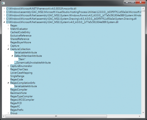
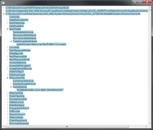
<TreeView ItemsSource="{Binding Source={StaticResource data}}"
VirtualizingStackPanel.VirtualizationMode="Recycling"
VirtualizingStackPanel.IsVirtualizing="True"
VirtualizingPanel.ScrollUnit="Item">
<TreeView.Resources>
<ObjectDataProvider x:Key="data" ObjectInstance="{x:Static sys:AppDomain.CurrentDomain}" MethodName="GetAssemblies" />
<HierarchicalDataTemplate DataType="{x:Type r:Assembly}" ItemsSource="{Binding Path=DefinedTypes}" >
<TextBlock Text="{Binding Path=Location}" />
</HierarchicalDataTemplate>
<HierarchicalDataTemplate DataType="{x:Type sys:Type}" ItemsSource="{Binding Path=CustomAttributes}">
<TextBlock Text="{Binding Path=Name}" />
</HierarchicalDataTemplate>
<HierarchicalDataTemplate DataType="{x:Type r:CustomAttributeData}" ItemsSource="{Binding Path=ConstructorArguments}">
<TextBlock Text="{Binding Path=AttributeType.Name}" />
</HierarchicalDataTemplate>
</TreeView.Resources>
<TreeView.ItemContainerStyle>
<Style TargetType="{x:Type TreeViewItem}">
<!-- == == BEGIN HERE == == -->
<Style.Resources>
<Style TargetType="{x:Type Border}">
<Setter Property="Grid.ColumnSpan" Value="2" />
</Style>
</Style.Resources>
<!-- == == == END == == == -->
<Setter Property="Background" Value="LightBlue" />
</Style>
</TreeView.ItemContainerStyle>
</TreeView>
</Window>
Jeśli uruchomisz ten program, jak pokazano, zobaczysz coś takiego. Jest to stałe zachowanie, które pozwala odzyskać pełną kontrolę nad zachowaniem rozciągania nagłówka TreeViewItem:
Zwróć uwagę na początkową/końcową część z przerywanymi liniami w źródle XAML. Zasadniczo ustawiam Grid.ColumnSpan=2 na Border, aby wypełniała rozciągniętą szerokość Grid. Ten element jest emitowany przez szablon TreeViewItem, więc odkryłem, że skutecznym sposobem zmiany jego właściwości jest kierowanie Stylew słownik zasobów z TreeViewItem's Style. Tak, mylące. To Style jest dostępne za pośrednictwem TreeViewItem.ItemContainerStyle.
Aby zobaczyć (istniejące) złamane zachowanie, możesz skomentować część między kropkowanymi liniami:
Ty można również ustawić te style w jakimś słowniku zasobów, zamiast używać właściwości ItemContainerStyle, Jak to zrobiłem tutaj. Zrobiłem to w ten sposób, ponieważ minimalizuje to zakres poprawki, tak aby nie miało to wpływu na niezwiązane kontrolki Border. Jeśli potrzebujesz bardziej dyskryminującego sposobu, aby celować tylko w tę kontrolę, możesz być w stanie skorzystać z faktu, że ma ona Name='Bd'.
[edit:] To rozwiązanie nie} używa refleksji! Nie bój się bezsensownych danych demo-to nie ma to nic wspólnego z tym problemem; był to po prostu najprostszy sposób, aby pobrać niektóre hierarchiczne dane do celów demonstracyjnych, zachowując cały program mały.
[edit #2:] właśnie zdałem sobie sprawę, że to, czego projektanci starali się uniknąć przy układzie siatki 3x2, to następujący nieestetyczny efekt (wyolbrzymiony tutaj przez powiększony zrzut ekranu). Jeśli więc przyjmiesz jedno z rozwiązań z tej strony, bądź uprzedzony, że możesz tego nie chcieć: {]}
Warning: date(): Invalid date.timezone value 'Europe/Kyiv', we selected the timezone 'UTC' for now. in /var/www/agent_stack/data/www/doraprojects.net/template/agent.layouts/content.php on line 54
2018-01-31 21:02:21
Jeśli masz na myśli coś takiego jak ten zrzut ekranu
Pełna Szerokość TreeViewItem http://www.bendewey.com/code/treeViewFullWidth2.png
Update Jak zauważono, ten przykład ma upadek bycia wciętym na subitemach
Pełna Szerokość TreeViewItem http://www.bendewey.com/code/treeViewFullWidth2a.png
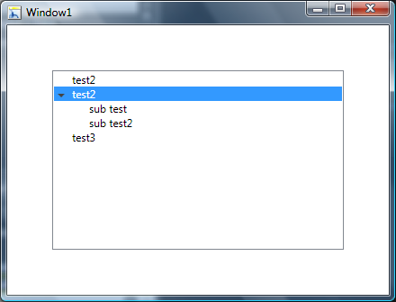
To powinno ci pomóc. Jego również opiera się na http://msdn.microsoft.com/en-us/library/ms788727.aspx możesz zmienić Szablon TreeViewItem na StackPanel i ustaw lewy margines Panelu ItemsPanel na 19. Następnie w widoku drzewa ustawiamy HorizontalContentAlignment= "Stretch". Załączam cały zasób poniżej, ale tutaj jest ważna część.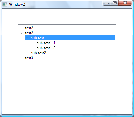
<ControlTemplate TargetType="{x:Type TreeViewItem}">
<StackPanel>
    <Border Name="Bd"
      Background="{TemplateBinding Background}"
      BorderBrush="{TemplateBinding BorderBrush}"
      BorderThickness="{TemplateBinding BorderThickness}"
      Padding="{TemplateBinding Padding}">
        <Grid>
        <Grid.ColumnDefinitions>
            <ColumnDefinition Width="19" />
            <ColumnDefinition />
        </Grid.ColumnDefinitions>
              <ToggleButton x:Name="Expander"
                      Style="{StaticResource ExpandCollapseToggleStyle}"
                      IsChecked="{Binding Path=IsExpanded,
                                  RelativeSource={RelativeSource TemplatedParent}}"
                      ClickMode="Press"/>
              <ContentPresenter x:Name="PART_Header"
                    Grid.Column="1"
                        ContentSource="Header"
                        HorizontalAlignment="{TemplateBinding HorizontalContentAlignment}"/>
        </Grid>
  </Border>
  <ItemsPresenter x:Name="ItemsHost" Margin="19,0,0,0" />
</StackPanel>
<!-- Triggers -->
</ControlTemplate>
Kontrola
<TreeView Margin="50" HorizontalContentAlignment="Stretch">
    <TreeViewItem Header="test2"/>
    <TreeViewItem Header="test2">
        <TreeViewItem Header="sub test"/>
        <TreeViewItem Header="sub test2"/>
    </TreeViewItem>
    <TreeViewItem Header="test3"/>
</TreeView>
Zasoby
<SolidColorBrush x:Key="GlyphBrush" Color="#444" />

<!--=================================================================
      TreeViewItem
  ==================================================================-->
<Style x:Key="ExpandCollapseToggleStyle" TargetType="ToggleButton">
  <Setter Property="Focusable" Value="False"/>
  <Setter Property="Template">
    <Setter.Value>
      <ControlTemplate TargetType="ToggleButton">
        <Grid
          Width="15"
          Height="13"
          Background="Transparent">
          <Path x:Name="ExpandPath"
            HorizontalAlignment="Left"
            VerticalAlignment="Center"
            Margin="1,1,1,1"
            Fill="{StaticResource GlyphBrush}"
            Data="M 4 0 L 8 4 L 4 8 Z"/>
        </Grid>
        <ControlTemplate.Triggers>
          <Trigger Property="IsChecked"
               Value="True">
            <Setter Property="Data"
                TargetName="ExpandPath"
                Value="M 0 4 L 8 4 L 4 8 Z"/>
          </Trigger>
        </ControlTemplate.Triggers>
      </ControlTemplate>
    </Setter.Value>
  </Setter>
</Style>
<Style x:Key="TreeViewItemFocusVisual">
  <Setter Property="Control.Template">
    <Setter.Value>
      <ControlTemplate>
        <Border>
          <Rectangle Margin="0,0,0,0"
                 StrokeThickness="5"
                 Stroke="Black"
                 StrokeDashArray="1 2"
                 Opacity="0"/>
        </Border>
      </ControlTemplate>
    </Setter.Value>
  </Setter>
</Style>


<Style x:Key="{x:Type TreeViewItem}"
     TargetType="{x:Type TreeViewItem}">
  <Setter Property="Background"
      Value="Transparent"/>
  <Setter Property="HorizontalContentAlignment"
      Value="{Binding Path=HorizontalContentAlignment,
              RelativeSource={RelativeSource AncestorType={x:Type ItemsControl}}}"/>
  <Setter Property="VerticalContentAlignment"
      Value="{Binding Path=VerticalContentAlignment,
              RelativeSource={RelativeSource AncestorType={x:Type ItemsControl}}}"/>
  <Setter Property="Padding"
      Value="1,0,0,0"/>
  <Setter Property="Foreground"
      Value="{DynamicResource {x:Static SystemColors.ControlTextBrushKey}}"/>
  <Setter Property="FocusVisualStyle"
      Value="{StaticResource TreeViewItemFocusVisual}"/>
  <Setter Property="Template">
    <Setter.Value>
      <ControlTemplate TargetType="{x:Type TreeViewItem}">
        <StackPanel>
            <Border Name="Bd"
              Background="{TemplateBinding Background}"
              BorderBrush="{TemplateBinding BorderBrush}"
              BorderThickness="{TemplateBinding BorderThickness}"
              Padding="{TemplateBinding Padding}">
            <Grid>
                <Grid.ColumnDefinitions>
                    <ColumnDefinition Width="19" />
                    <ColumnDefinition />
                </Grid.ColumnDefinitions>
                  <ToggleButton x:Name="Expander"
                          Style="{StaticResource ExpandCollapseToggleStyle}"
                          IsChecked="{Binding Path=IsExpanded,
                                      RelativeSource={RelativeSource TemplatedParent}}"
                          ClickMode="Press"/>
                <ContentPresenter x:Name="PART_Header"
                            Grid.Column="1"
                          ContentSource="Header"
                          HorizontalAlignment="{TemplateBinding HorizontalContentAlignment}"/>
            </Grid>
          </Border>
          <ItemsPresenter x:Name="ItemsHost" Margin="19,0,0,0" />
        </StackPanel>
        <ControlTemplate.Triggers>
          <Trigger Property="IsExpanded"
               Value="false">
            <Setter TargetName="ItemsHost"
                Property="Visibility"
                Value="Collapsed"/>
          </Trigger>
          <Trigger Property="HasItems"
               Value="false">
            <Setter TargetName="Expander"
                Property="Visibility"
                Value="Hidden"/>
          </Trigger>
          <MultiTrigger>
            <MultiTrigger.Conditions>
              <Condition Property="HasHeader"
                     Value="false"/>
              <Condition Property="Width"
                     Value="Auto"/>
            </MultiTrigger.Conditions>
            <Setter TargetName="PART_Header"
                Property="MinWidth"
                Value="75"/>
          </MultiTrigger>
          <MultiTrigger>
            <MultiTrigger.Conditions>
              <Condition Property="HasHeader"
                     Value="false"/>
              <Condition Property="Height"
                     Value="Auto"/>
            </MultiTrigger.Conditions>
            <Setter TargetName="PART_Header"
                Property="MinHeight"
                Value="19"/>
          </MultiTrigger>
          <Trigger Property="IsSelected"
               Value="true">
            <Setter TargetName="Bd"
                Property="Background"
                Value="{DynamicResource {x:Static SystemColors.HighlightBrushKey}}"/>
            <Setter Property="Foreground"
                Value="{DynamicResource {x:Static SystemColors.HighlightTextBrushKey}}"/>
          </Trigger>
          <MultiTrigger>
            <MultiTrigger.Conditions>
              <Condition Property="IsSelected"
                     Value="true"/>
              <Condition Property="IsSelectionActive"
                     Value="false"/>
            </MultiTrigger.Conditions>
            <Setter TargetName="Bd"
                Property="Background"
                Value="{DynamicResource {x:Static SystemColors.ControlBrushKey}}"/>
            <Setter Property="Foreground"
                Value="{DynamicResource {x:Static SystemColors.ControlTextBrushKey}}"/>
          </MultiTrigger>
          <Trigger Property="IsEnabled"
               Value="false">
            <Setter Property="Foreground"
                Value="{DynamicResource {x:Static SystemColors.GrayTextBrushKey}}"/>
          </Trigger>
        </ControlTemplate.Triggers>
      </ControlTemplate>
    </Setter.Value>
  </Setter>
</Style>
Warning: date(): Invalid date.timezone value 'Europe/Kyiv', we selected the timezone 'UTC' for now. in /var/www/agent_stack/data/www/doraprojects.net/template/agent.layouts/content.php on line 54
2009-03-23 03:25:58
Jeśli masz na myśli coś takiego jak ten zrzut ekranu
LineItem Hightlighting in a TreeView http://www.bendewey.com/code/treeViewFullWidth.png
To powinno ci pomóc. Its based on http://msdn.microsoft.com/en-us/library/ms788727.aspx możesz wprowadzić pewne zmiany w układzie siatki drzewa. Zasadniczo usuwasz trzecią kolumnę. Następnie w widoku drzewa ustawiamy HorizontalContentAlignment= "Stretch". Załączam cały zasób poniżej, ale oto ważna część.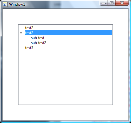
<!-- ... -->
<ControlTemplate TargetType="{x:Type TreeViewItem}">
  <Grid>
    <Grid.ColumnDefinitions>
      <ColumnDefinition MinWidth="19"
                Width="Auto"/>
      <ColumnDefinition Width="*"/>
    </Grid.ColumnDefinitions>
    <Grid.RowDefinitions>
      <RowDefinition Height="Auto"/>
      <RowDefinition/>
    </Grid.RowDefinitions>
    <!-- ... -->
Kontrola
<TreeView Margin="50" HorizontalContentAlignment="Stretch">
    <TreeViewItem Header="test2"/>
    <TreeViewItem Header="test2">
        <TreeViewItem Header="sub test"/>
        <TreeViewItem Header="sub test2"/>
    </TreeViewItem>
    <TreeViewItem Header="test3"/>
</TreeView>
Zasoby
<SolidColorBrush x:Key="GlyphBrush" Color="#444" />

<!--=================================================================
   TreeViewItem
==================================================================-->
<Style x:Key="ExpandCollapseToggleStyle" TargetType="ToggleButton">
  <Setter Property="Focusable" Value="False"/>
  <Setter Property="Template">
    <Setter.Value>
      <ControlTemplate TargetType="ToggleButton">
        <Grid
          Width="15"
          Height="13"
          Background="Transparent">
          <Path x:Name="ExpandPath"
            HorizontalAlignment="Left"
            VerticalAlignment="Center"
            Margin="1,1,1,1"
            Fill="{StaticResource GlyphBrush}"
            Data="M 4 0 L 8 4 L 4 8 Z"/>
        </Grid>
        <ControlTemplate.Triggers>
          <Trigger Property="IsChecked"
               Value="True">
            <Setter Property="Data"
                TargetName="ExpandPath"
                Value="M 0 4 L 8 4 L 4 8 Z"/>
          </Trigger>
        </ControlTemplate.Triggers>
      </ControlTemplate>
    </Setter.Value>
  </Setter>
</Style>
<Style x:Key="TreeViewItemFocusVisual">
  <Setter Property="Control.Template">
    <Setter.Value>
      <ControlTemplate>
        <Border>
          <Rectangle Margin="0,0,0,0"
                 StrokeThickness="5"
                 Stroke="Black"
                 StrokeDashArray="1 2"
                 Opacity="0"/>
        </Border>
      </ControlTemplate>
    </Setter.Value>
  </Setter>
</Style>


<Style x:Key="{x:Type TreeViewItem}"
     TargetType="{x:Type TreeViewItem}">
  <Setter Property="Background"
      Value="Transparent"/>
  <Setter Property="HorizontalContentAlignment"
      Value="{Binding Path=HorizontalContentAlignment,
              RelativeSource={RelativeSource AncestorType={x:Type ItemsControl}}}"/>
  <Setter Property="VerticalContentAlignment"
      Value="{Binding Path=VerticalContentAlignment,
              RelativeSource={RelativeSource AncestorType={x:Type ItemsControl}}}"/>
  <Setter Property="Padding"
      Value="1,0,0,0"/>
  <Setter Property="Foreground"
      Value="{DynamicResource {x:Static SystemColors.ControlTextBrushKey}}"/>
  <Setter Property="FocusVisualStyle"
      Value="{StaticResource TreeViewItemFocusVisual}"/>
  <Setter Property="Template">
    <Setter.Value>
      <ControlTemplate TargetType="{x:Type TreeViewItem}">
        <Grid>
          <Grid.ColumnDefinitions>
            <ColumnDefinition MinWidth="19"
                      Width="Auto"/>
            <ColumnDefinition Width="*"/>
          </Grid.ColumnDefinitions>
          <Grid.RowDefinitions>
            <RowDefinition Height="Auto"/>
            <RowDefinition/>
          </Grid.RowDefinitions>
          <ToggleButton x:Name="Expander"
                  Style="{StaticResource ExpandCollapseToggleStyle}"
                  IsChecked="{Binding Path=IsExpanded,
                              RelativeSource={RelativeSource TemplatedParent}}"
                  ClickMode="Press"/>
          <Border Name="Bd"
              Grid.Column="1"
              Background="{TemplateBinding Background}"
              BorderBrush="{TemplateBinding BorderBrush}"
              BorderThickness="{TemplateBinding BorderThickness}"
              Padding="{TemplateBinding Padding}">
            <ContentPresenter x:Name="PART_Header"
                      ContentSource="Header"
                      HorizontalAlignment="{TemplateBinding HorizontalContentAlignment}"/>
          </Border>
          <ItemsPresenter x:Name="ItemsHost"
                  Grid.Row="1"
                  Grid.Column="1"/>
        </Grid>
        <ControlTemplate.Triggers>
          <Trigger Property="IsExpanded" Value="false">
            <Setter TargetName="ItemsHost" Property="Visibility" Value="Collapsed"/>
          </Trigger>
          <Trigger Property="HasItems" Value="false">
            <Setter TargetName="Expander" Property="Visibility" Value="Hidden"/>
          </Trigger>
          <MultiTrigger>
            <MultiTrigger.Conditions>
              <Condition Property="HasHeader" Value="false"/>
              <Condition Property="Width" Value="Auto"/>
            </MultiTrigger.Conditions>
            <Setter TargetName="PART_Header" Property="MinWidth" Value="75"/>
          </MultiTrigger>
          <MultiTrigger>
            <MultiTrigger.Conditions>
              <Condition Property="HasHeader" Value="false"/>
              <Condition Property="Height" Value="Auto"/>
            </MultiTrigger.Conditions>
            <Setter TargetName="PART_Header" Property="MinHeight" Value="19"/>
          </MultiTrigger>
          <Trigger Property="IsSelected" Value="true">
            <Setter TargetName="Bd" Property="Background" Value="{DynamicResource {x:Static SystemColors.HighlightBrushKey}}"/>
            <Setter Property="Foreground" Value="{DynamicResource {x:Static SystemColors.HighlightTextBrushKey}}"/>
          </Trigger>
          <MultiTrigger>
            <MultiTrigger.Conditions>
              <Condition Property="IsSelected" Value="true"/>
              <Condition Property="IsSelectionActive" Value="false"/>
            </MultiTrigger.Conditions>
            <Setter TargetName="Bd" Property="Background" Value="{DynamicResource {x:Static SystemColors.ControlBrushKey}}"/>
            <Setter Property="Foreground" Value="{DynamicResource {x:Static SystemColors.ControlTextBrushKey}}"/>
          </MultiTrigger>
          <Trigger Property="IsEnabled" Value="false">
            <Setter Property="Foreground" Value="{DynamicResource {x:Static SystemColors.GrayTextBrushKey}}"/>
          </Trigger>
        </ControlTemplate.Triggers>
      </ControlTemplate>
    </Setter.Value>
  </Setter>
</Style>
Warning: date(): Invalid date.timezone value 'Europe/Kyiv', we selected the timezone 'UTC' for now. in /var/www/agent_stack/data/www/doraprojects.net/template/agent.layouts/content.php on line 54
2009-03-20 02:13:12
Jest to zdecydowanie najprostsze rozwiązanie. Po prostu utwórz prostokąt, nazwij go Hb i ustaw jego margines na-100px i nie będzie widoczny. Ustaw ją na widoczną tylko po wybraniu jej lub najechaniu myszką. To jest hack, ale jesteś dobry dla maksymalnie 5 poziomów zagnieżdżonych TreeViewItems (100 > 19*5)
     <ControlTemplate TargetType="{x:Type TreeViewItem}">
  <Grid>
   <Grid.ColumnDefinitions>
    <ColumnDefinition MinWidth="19" Width="Auto"/>
    <ColumnDefinition Width="*"/>
   </Grid.ColumnDefinitions>
   <Grid.RowDefinitions>
    <RowDefinition Height="Auto"/>
    <RowDefinition/>
   </Grid.RowDefinitions>
                        <ToggleButton x:Name="Expander" Style="{StaticResource ExpandCollapseToggleStyle}" IsChecked="{Binding IsExpanded, RelativeSource={RelativeSource TemplatedParent}}" ClickMode="Press" VerticalAlignment="Top" Panel.ZIndex="1"/>
   <Rectangle x:Name="Hb" Width="Auto" Height="Auto" Grid.ColumnSpan="2" Margin="-100,0,0,0" Panel.ZIndex="-1" Visibility="Hidden" />
                        <Border x:Name="Bd" SnapsToDevicePixels="true" BorderThickness="{TemplateBinding BorderThickness}" Padding="{TemplateBinding Padding}" Grid.Column="1" Panel.ZIndex="0">
    <ContentPresenter x:Name="PART_Header" SnapsToDevicePixels="{TemplateBinding SnapsToDevicePixels}" ContentSource="Header" HorizontalAlignment="Stretch"/>
   </Border>
   <ItemsPresenter x:Name="ItemsHost" Grid.Column="0" Grid.Row="1" Grid.ColumnSpan="2" Margin="19,0,0,0"/>
  </Grid>
Warning: date(): Invalid date.timezone value 'Europe/Kyiv', we selected the timezone 'UTC' for now. in /var/www/agent_stack/data/www/doraprojects.net/template/agent.layouts/content.php on line 54
2009-10-26 21:33:49
Źródłem problemu przy używaniu TreeView z ItemsSource jest, odwołany z link text , zmieniłem Kod klasy TreeViewItemExtensions:
public static class TreeViewItemExtensions
{
    public static int GetDepth(this TreeViewItem item)
    {
        while (GetSelectedTreeViewItemParent(item) != null)
        {
            var parent = GetSelectedTreeViewItemParent(item);
            if (parent != null)
                return parent.GetDepth() + 1;

            item = parent;
        }
        return 0;
 }

 public static TreeViewItem GetSelectedTreeViewItemParent(this TreeViewItem item)
 {
        DependencyObject parent = VisualTreeHelper.GetParent(item);
        while (!(parent is TreeViewItem || parent is TreeView))
        {
            parent = VisualTreeHelper.GetParent(parent);
        }

        return parent as TreeViewItem;
  }
}
Warning: date(): Invalid date.timezone value 'Europe/Kyiv', we selected the timezone 'UTC' for now. in /var/www/agent_stack/data/www/doraprojects.net/template/agent.layouts/content.php on line 54
2009-09-24 04:58:05
Użyłem czegoś takiego jak theseven7, aby ułatwić korzystanie z kodu bendewey ' a z szablonami TreeViewItems...
    public static int GetDepth(this TreeViewItem item)
    {
        FrameworkElement elem = item;
        var parent = VisualTreeHelper.GetParent(item);
        var count = 0;
        while (parent != null && !(parent is TreeView))
        {
            var tvi = parent as TreeViewItem;
            if (parent is TreeViewItem)
                count++;
            parent = VisualTreeHelper.GetParent(parent);
        }
        return count;
    }
Warning: date(): Invalid date.timezone value 'Europe/Kyiv', we selected the timezone 'UTC' for now. in /var/www/agent_stack/data/www/doraprojects.net/template/agent.layouts/content.php on line 54
2010-08-06 21:14:05
Udało mi się to poprzez skopiowanie ItemContainerStyle za pomocą blend, nadanie nazwy siatce, w której element jest umieszczony, a następnie ustawienie tła siatki.
Dla podejścia tylko XAML wziąłem jedno z rozwiązań Bendewey ' a i rozbiłem je trochę na bardziej podstawowe rozwiązanie:
Poniższy styl powinien zezwalać elementom Treeview na rozciąganie się:
<Style TargetType="{x:Type TreeViewItem}">
    <Setter Property="Template">
        <Setter.Value>
            <ControlTemplate TargetType="{x:Type TreeViewItem}">
                <Grid>
                    <Grid.ColumnDefinitions>
                        <ColumnDefinition MinWidth="19"
                  Width="Auto"/>
                        <ColumnDefinition Width="*"/>
                    </Grid.ColumnDefinitions>
                    <Grid.RowDefinitions>
                        <RowDefinition Height="Auto"/>
                        <RowDefinition/>
                    </Grid.RowDefinitions>
                    <ToggleButton x:Name="Expander"
              Content="..."
              IsChecked="{Binding Path=IsExpanded,
                          RelativeSource={RelativeSource TemplatedParent}}"
              ClickMode="Press"/>
                    <Border Name="Bd" Grid.Column="1" Background="Red" Padding="3">
                        <ContentPresenter x:Name="PART_Header"   ContentSource="Header"
                  HorizontalAlignment="{TemplateBinding HorizontalContentAlignment}"/>
                    </Border>
                    <ItemsPresenter x:Name="ItemsHost"  Grid.Row="1"   Grid.Column="1"/>
                </Grid>
      <!-- ADD TRIGGERS HERE -->
            </ControlTemplate>
        </Setter.Value>
    </Setter>
</Style>
Aby uruchomić i zwinąć się jak właściwy Treeview, poniższe wyzwalacze powinny na to pozwolić:
<ControlTemplate.Triggers>
                    <MultiTrigger>
                        <MultiTrigger.Conditions>
                            <Condition Property="HasHeader" Value="false"/>
                            <Condition Property="Width" Value="Auto"/>
                        </MultiTrigger.Conditions>
                    </MultiTrigger>
                    <MultiTrigger>
                        <MultiTrigger.Conditions>
                            <Condition Property="HasHeader" Value="false"/>
                            <Condition Property="Height" Value="Auto"/>
                        </MultiTrigger.Conditions>
                    </MultiTrigger>
                    <MultiTrigger>
                        <MultiTrigger.Conditions>
                            <Condition Property="IsSelected" Value="true"/>
                            <Condition Property="IsSelectionActive" Value="false"/>
                        </MultiTrigger.Conditions>
                    </MultiTrigger>
                    <Trigger Property="IsSelected" Value="true">
                        <Setter TargetName="Bd" Property="Background" Value="Blue"/>
                    </Trigger>
                    <Trigger Property="HasItems" Value="false">
                        <Setter TargetName="Expander" Property="Visibility" Value="Hidden"/>
                    </Trigger>
                    <Trigger Property="IsExpanded"   Value="false">
                        <Setter TargetName="ItemsHost"
                                Property="Visibility"
                                Value="Collapsed"/>
                    </Trigger>
</ControlTemplate.Triggers>
Wystarczy umieścić wyzwalacze w szablonie sterowania. Kolory / wyściółka / projekt będzie musiał być dostosowany do własnych potrzeb, ale powyższe powinno być bardzo podstawowym pomysłem na Fundacja tylko XAML.
Warning: date(): Invalid date.timezone value 'Europe/Kyiv', we selected the timezone 'UTC' for now. in /var/www/agent_stack/data/www/doraprojects.net/template/agent.layouts/content.php on line 54
2017-09-19 06:41:58