Pokaż limity ufności i limity przewidywania na wykresie punktowym
Mam dwie tablice danych jako wysokość i wagę:
import numpy as np, matplotlib.pyplot as plt

heights = np.array([50,52,53,54,58,60,62,64,66,67,68,70,72,74,76,55,50,45,65])
weights = np.array([25,50,55,75,80,85,50,65,85,55,45,45,50,75,95,65,50,40,45])

plt.plot(heights,weights,'bo')
plt.show()
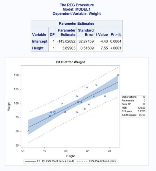
Chcę stworzyć fabułę podobną do tej:
Http://www.sas.com/en_us/software/analytics/stat.html#m=screenshot6
4 answers
Oto, co zebrałem. Starałem się dokładnie naśladować twój zrzut ekranu.
Given
Niektóre szczegółowe funkcje pomocnicze do kreślenia przedziałów ufności.
import numpy as np
import scipy as sp
import scipy.stats as stats
import matplotlib.pyplot as plt


%matplotlib inline


def plot_ci_manual(t, s_err, n, x, x2, y2, ax=None):
    """Return an axes of confidence bands using a simple approach.

    Notes
    -----
    .. math:: \left| \: \hat{\mu}_{y|x0} - \mu_{y|x0} \: \right| \; \leq \; T_{n-2}^{.975} \; \hat{\sigma} \; \sqrt{\frac{1}{n}+\frac{(x_0-\bar{x})^2}{\sum_{i=1}^n{(x_i-\bar{x})^2}}}
    .. math:: \hat{\sigma} = \sqrt{\sum_{i=1}^n{\frac{(y_i-\hat{y})^2}{n-2}}}

    References
    ----------
    .. [1] M. Duarte.  "Curve fitting," Jupyter Notebook.
       http://nbviewer.ipython.org/github/demotu/BMC/blob/master/notebooks/CurveFitting.ipynb

    """
    if ax is None:
        ax = plt.gca()

    ci = t * s_err * np.sqrt(1/n + (x2 - np.mean(x))**2 / np.sum((x - np.mean(x))**2))
    ax.fill_between(x2, y2 + ci, y2 - ci, color="#b9cfe7", edgecolor="")

    return ax


def plot_ci_bootstrap(xs, ys, resid, nboot=500, ax=None):
    """Return an axes of confidence bands using a bootstrap approach.

    Notes
    -----
    The bootstrap approach iteratively resampling residuals.
    It plots `nboot` number of straight lines and outlines the shape of a band.
    The density of overlapping lines indicates improved confidence.

    Returns
    -------
    ax : axes
        - Cluster of lines
        - Upper and Lower bounds (high and low) (optional)  Note: sensitive to outliers

    References
    ----------
    .. [1] J. Stults. "Visualizing Confidence Intervals", Various Consequences.
       http://www.variousconsequences.com/2010/02/visualizing-confidence-intervals.html

    """
    if ax is None:
        ax = plt.gca()

    bootindex = sp.random.randint

    for _ in range(nboot):
        resamp_resid = resid[bootindex(0, len(resid) - 1, len(resid))]
        # Make coeffs of for polys
        pc = sp.polyfit(xs, ys + resamp_resid, 1)
        # Plot bootstrap cluster
        ax.plot(xs, sp.polyval(pc, xs), "b-", linewidth=2, alpha=3.0 / float(nboot))

    return ax
Kod
# Computations ----------------------------------------------------------------
# Raw Data
heights = np.array([50,52,53,54,58,60,62,64,66,67,68,70,72,74,76,55,50,45,65])
weights = np.array([25,50,55,75,80,85,50,65,85,55,45,45,50,75,95,65,50,40,45])

x = heights
y = weights

# Modeling with Numpy
def equation(a, b):
    """Return a 1D polynomial."""
    return np.polyval(a, b)

p, cov = np.polyfit(x, y, 1, cov=True)                     # parameters and covariance from of the fit of 1-D polynom.
y_model = equation(p, x)                                   # model using the fit parameters; NOTE: parameters here are coefficients

# Statistics
n = weights.size                                           # number of observations
m = p.size                                                 # number of parameters
dof = n - m                                                # degrees of freedom
t = stats.t.ppf(0.975, n - m)                              # used for CI and PI bands

# Estimates of Error in Data/Model
resid = y - y_model
chi2 = np.sum((resid / y_model)**2)                        # chi-squared; estimates error in data
chi2_red = chi2 / dof                                      # reduced chi-squared; measures goodness of fit
s_err = np.sqrt(np.sum(resid**2) / dof)                    # standard deviation of the error


# Plotting --------------------------------------------------------------------
fig, ax = plt.subplots(figsize=(8, 6))

# Data
ax.plot(
    x, y, "o", color="#b9cfe7", markersize=8,
    markeredgewidth=1, markeredgecolor="b", markerfacecolor="None"
)

# Fit
ax.plot(x, y_model, "-", color="0.1", linewidth=1.5, alpha=0.5, label="Fit")

x2 = np.linspace(np.min(x), np.max(x), 100)
y2 = equation(p, x2)

# Confidence Interval (select one)
plot_ci_manual(t, s_err, n, x, x2, y2, ax=ax)
#plot_ci_bootstrap(x, y, resid, ax=ax)

# Prediction Interval
pi = t * s_err * np.sqrt(1 + 1/n + (x2 - np.mean(x))**2 / np.sum((x - np.mean(x))**2))
ax.fill_between(x2, y2 + pi, y2 - pi, color="None", linestyle="--")
ax.plot(x2, y2 - pi, "--", color="0.5", label="95% Prediction Limits")
ax.plot(x2, y2 + pi, "--", color="0.5")


# Figure Modifications --------------------------------------------------------
# Borders
ax.spines["top"].set_color("0.5")
ax.spines["bottom"].set_color("0.5")
ax.spines["left"].set_color("0.5")
ax.spines["right"].set_color("0.5")
ax.get_xaxis().set_tick_params(direction="out")
ax.get_yaxis().set_tick_params(direction="out")
ax.xaxis.tick_bottom()
ax.yaxis.tick_left()

# Labels
plt.title("Fit Plot for Weight", fontsize="14", fontweight="bold")
plt.xlabel("Height")
plt.ylabel("Weight")
plt.xlim(np.min(x) - 1, np.max(x) + 1)

# Custom legend
handles, labels = ax.get_legend_handles_labels()
display = (0, 1)
anyArtist = plt.Line2D((0, 1), (0, 0), color="#b9cfe7")    # create custom artists
legend = plt.legend(
    [handle for i, handle in enumerate(handles) if i in display] + [anyArtist],
    [label for i, label in enumerate(labels) if i in display] + ["95% Confidence Limits"],
    loc=9, bbox_to_anchor=(0, -0.21, 1., 0.102), ncol=3, mode="expand"
)
frame = legend.get_frame().set_edgecolor("0.5")

# Save Figure
plt.tight_layout()
plt.savefig("filename.png", bbox_extra_artists=(legend,), bbox_inches="tight")

plt.show()
Wyjście
Używając plot_ci_manual():

Używając plot_ci_bootstrap():

Szczegóły
Wierzę, że od legenda znajduje się poza figurą, nie pojawia się w wyskakującym oknie matplotblib. Działa dobrze w Jupyterze używając
%maplotlib inline.Kod podstawowego przedziału ufności (
plot_ci_manual()) jest zaadaptowany z innego źródła tworzącego Wykres podobny do OP. możesz wybrać bardziej zaawansowaną technikę o nazwie residual bootstrapping , zaznaczając drugą opcjęplot_ci_bootstrap().
Aktualizacje
- ten post został zaktualizowany o poprawiony kod zgodny z Pythonem 3.
-
stats.t.ppf()przyjmuje prawdopodobieństwo dolnego ogona. Zgodnie z poniższymi zasobami,t = sp.stats.t.ppf(0.95, n - m)została skorygowana dot = sp.stats.t.ppf(0.975, n - m), aby odzwierciedlić dwustronną 95% statystykę t (lub jednostronną 97,5% statystykę t).- oryginalny zeszyt i równanie
- odniesienie do statystyk (Dzięki @ Bonlenfum i @tryptofan)
- verified t-value given
dof=17
-
y2został zaktualizowany, aby reagować bardziej elastycznie z danym modelem (@regeneracja). - abstrakcyjna
equationfunkcja została dodana do zawijania funkcji modelu. Regresje nieliniowe są możliwe, chociaż nie wykazano. Zmień odpowiednie zmienne w razie potrzeby(dzięki @PJW).
Zobacz Też
-
ten post o planowaniu opasek z
statsmodelsbiblioteką. -
ten tutorial na wykreślanie pasm i obliczanie przedziałów ufności za pomocą
uncertaintiesbiblioteki (instaluj ostrożnie w osobne środowisko).
Warning: date(): Invalid date.timezone value 'Europe/Kyiv', we selected the timezone 'UTC' for now. in /var/www/agent_stack/data/www/doraprojects.net/template/agent.layouts/content.php on line 54
2019-07-11 16:32:52
Możesz użyć biblioteki Seaborn do tworzenia wykresów, jak chcesz.
In [18]: import seaborn as sns

In [19]: heights = np.array([50,52,53,54,58,60,62,64,66,67, 68,70,72,74,76,55,50,45,65])
    ...: weights = np.array([25,50,55,75,80,85,50,65,85,55,45,45,50,75,95,65,50,40,45])
    ...:

In [20]: sns.regplot(heights,weights, color ='blue')
Out[20]: <matplotlib.axes.AxesSubplot at 0x13644f60>
Warning: date(): Invalid date.timezone value 'Europe/Kyiv', we selected the timezone 'UTC' for now. in /var/www/agent_stack/data/www/doraprojects.net/template/agent.layouts/content.php on line 54
2014-11-27 09:03:12
Dla mojego projektu musiałem stworzyć interwały do modelowania szeregów czasowych, a aby usprawnić procedurę, stworzyłem tsmoothie : bibliotekę Pythona do wygładzania szeregów czasowych i wykrywania odstających w wektorowy sposób.
Zapewnia różne algorytmy wygładzania wraz z możliwością obliczania interwałów.
W przypadku regresji liniowej:
import numpy as np
import matplotlib.pyplot as plt
from tsmoothie.smoother import *
from tsmoothie.utils_func import sim_randomwalk

# generate 10 randomwalks of length 50
np.random.seed(33)
data = sim_randomwalk(n_series=10, timesteps=50,
                      process_noise=10, measure_noise=30)

# operate smoothing
smoother = PolynomialSmoother(degree=1)
smoother.smooth(data)

# generate intervals
low_pi, up_pi = smoother.get_intervals('prediction_interval', confidence=0.05)
low_ci, up_ci = smoother.get_intervals('confidence_interval', confidence=0.05)

# plot the first smoothed timeseries with intervals
plt.figure(figsize=(11,6))
plt.plot(smoother.smooth_data[0], linewidth=3, color='blue')
plt.plot(smoother.data[0], '.k')
plt.fill_between(range(len(smoother.data[0])), low_pi[0], up_pi[0], alpha=0.3, color='blue')
plt.fill_between(range(len(smoother.data[0])), low_ci[0], up_ci[0], alpha=0.3, color='blue')
W przypadku regresji o porządku większym niż 1:
# operate smoothing
smoother = PolynomialSmoother(degree=5)
smoother.smooth(data)

# generate intervals
low_pi, up_pi = smoother.get_intervals('prediction_interval', confidence=0.05)
low_ci, up_ci = smoother.get_intervals('confidence_interval', confidence=0.05)

# plot the first smoothed timeseries with intervals
plt.figure(figsize=(11,6))
plt.plot(smoother.smooth_data[0], linewidth=3, color='blue')
plt.plot(smoother.data[0], '.k')
plt.fill_between(range(len(smoother.data[0])), low_pi[0], up_pi[0], alpha=0.3, color='blue')
plt.fill_between(range(len(smoother.data[0])), low_ci[0], up_ci[0], alpha=0.3, color='blue')

Zaznaczam również, że tsmoothie może przeprowadzić wygładzanie wielu szeregów czasowych w sposób wektorowy. Mam nadzieję, że to może komuś pomóc
Warning: date(): Invalid date.timezone value 'Europe/Kyiv', we selected the timezone 'UTC' for now. in /var/www/agent_stack/data/www/doraprojects.net/template/agent.layouts/content.php on line 54
2020-09-09 14:41:26
Muszę od czasu do czasu robić coś takiego... to był mój pierwszy raz robi to z Python / Jupyter,a ten post Bardzo mi pomaga, szczególnie szczegółowa odpowiedź Pylang.
Wiem, że są "łatwiejsze" sposoby, aby się tam dostać, ale myślę, że ta droga jest o wiele bardziej dydaktyczna i pozwala mi dowiedzieć się krok po kroku, co się dzieje. Nauczyłem się nawet tutaj, że istnieją "interwały przewidywania"! Dzięki.
Poniżej znajduje się kod Pylang w prostszy sposób, w tym obliczenie Korelacja Pearsona (a więc R2) i średni błąd kwadratowy (MSE). Oczywiście, ostateczna fabuła (!) muszą być dostosowane do każdego zbioru danych...
import numpy as np
import matplotlib.pyplot as plt
import scipy.stats as stats

heights = np.array([50,52,53,54,58,60,62,64,66,67,68,70,72,74,76,55,50,45,65])
weights = np.array([25,50,55,75,80,85,50,65,85,55,45,45,50,75,95,65,50,40,45])

x = heights
y = weights

slope, intercept = np.polyfit(x, y, 1)  # linear model adjustment

y_model = np.polyval([slope, intercept], x)   # modeling...

x_mean = np.mean(x)
y_mean = np.mean(y)
n = x.size                        # number of samples
m = 2                             # number of parameters
dof = n - m                       # degrees of freedom
t = stats.t.ppf(0.975, dof)       # Students statistic of interval confidence

residual = y - y_model

std_error = (np.sum(residual**2) / dof)**.5   # Standard deviation of the error

# calculating the r2
# https://www.statisticshowto.com/probability-and-statistics/coefficient-of-determination-r-squared/
# Pearson's correlation coefficient
numerator = np.sum((x - x_mean)*(y - y_mean))
denominator = ( np.sum((x - x_mean)**2) * np.sum((y - y_mean)**2) )**.5
correlation_coef = numerator / denominator
r2 = correlation_coef**2

# mean squared error
MSE = 1/n * np.sum( (y - y_model)**2 )

# to plot the adjusted model
x_line = np.linspace(np.min(x), np.max(x), 100)
y_line = np.polyval([slope, intercept], x_line)

# confidence interval
ci = t * std_error * (1/n + (x_line - x_mean)**2 / np.sum((x - x_mean)**2))**.5
# predicting interval
pi = t * std_error * (1 + 1/n + (x_line - x_mean)**2 / np.sum((x - x_mean)**2))**.5

############### Ploting
plt.rcParams.update({'font.size': 14})
fig = plt.figure()
ax = fig.add_axes([.1, .1, .8, .8])

ax.plot(x, y, 'o', color = 'royalblue')
ax.plot(x_line, y_line, color = 'royalblue')
ax.fill_between(x_line, y_line + pi, y_line - pi, color = 'lightcyan', label = '95% prediction interval')
ax.fill_between(x_line, y_line + ci, y_line - ci, color = 'skyblue', label = '95% confidence interval')

ax.set_xlabel('x')
ax.set_ylabel('y')

# rounding and position must be changed for each case and preference
a = str(np.round(intercept))
b = str(np.round(slope,2))
r2s = str(np.round(r2,2))
MSEs = str(np.round(MSE))

ax.text(45, 110, 'y = ' + a + ' + ' + b + ' x')
ax.text(45, 100, '$r^2$ = ' + r2s + '     MSE = ' + MSEs)

plt.legend(bbox_to_anchor=(1, .25), fontsize=12)

Warning: date(): Invalid date.timezone value 'Europe/Kyiv', we selected the timezone 'UTC' for now. in /var/www/agent_stack/data/www/doraprojects.net/template/agent.layouts/content.php on line 54
2020-12-29 17:27:24